Parallel-Parallel is a gallery of works by graphic designers that
a) have been postponed indefinitely,
b) will never be realized or published,
c) were published for an event that will never take place because of this damn virus.

We believe that graphic design plays with potential realities and with this current crisis we want to see what has been left, on pause, in your hands.

If you are a graphic designer and have been working on a project that fits this description please reach out to us via:
email@parallel-parallel.com

We are looking forward to hearing from you,
your fellow designers,
Dorothee Dähler & Yeliz Secerli

PS: This website is programmed by Quentin Creuzet!
Weltformat Magazine

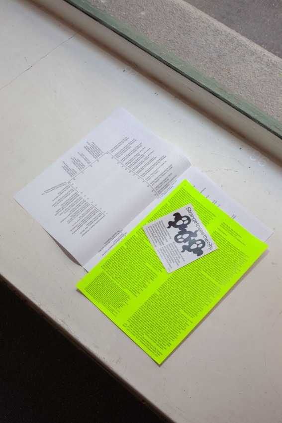
Weltformat is an annual graphic design festival which takes place in Lucerne (CH). It was one of the rare events that were realized despite the virus in 2020. The newly launched Welformat magazine offers background information, this year’s theme was “Not (Yet) Canceled.” Sound familiar? The essays and projects were manifested, initiated and kick-started because of the pandemic. Read thoroughly, flip slowly, and enjoy a surprise parallel appearance in the end.
Buy it here

Intimations: Six Essays by Zadie Smith

We finally have our reward (thank you COVID19!) with Intimations, a collection of essays that tells us exactly what Zadie Smith has been thinking all this time! She walks us through her personal experience of the pandemic. She writes as a coping mechanism, as a place to hide. She looks into herself, then her people, and the people outside. She writes about the city she lives, loves and leaves (New York), and the rotten roots of the country and its ongoing bad behavior. When you finish it, you feel like you’ve undergone heart surgery; the heart aches but you’ve been given a second chance to live life with a new set of priorities.
Buy it here

What The Great Pandemic Novels Teach Us

In this article, Orhan Pamuk demonstrates the remarkably consistent ways in which humans throughout history have responded to fear. After extensive research for his new novel, Pamuk takes us on a journey through many of the most enjoyable pandemics in history; both fictional and true. Following extensive research for his new novel, Pamuk guides us through both fictional and true accounts of some of the most enjoyable pandemics in history!
Read it here

What Are Parallel Universes?

In this unusual interview, Fred Alan Wolf, quantum physics specialist explains the concept of parallel universes so that even the interviewer begins to understand it! Wolf says that quantum physics explains many facts of physical life. Yet it is still a mystery to most experts which isn’t very reassuring. Perhaps they have it all figured out in another universe.
Read it here

Parallel Cards by Ryan Gander & Europa

Ryan Gander isn’t just the joker in the pack.
Look behind the poker-faced humor of these parallel cards (playing cards where both sides are the front) and you realize there is more depth to the concept. His perception of playing cards has taken on a journey of its own since he was a child and the aesthetics of their usage within this deck opens up a universe of new possibilities.
Get them here

The Third Policeman

In this essay, Ted Gioia explores (and delights in!) The Third Policeman—a novel by Flann O’Brien (the pen name of Irish author Brian O’Nolan). This surrealist crime novel, now regarded as a literary classic, remained unpublished until 1967, one year after his death (nobody appears to have made a crime novel out of this fact!) “A book that starts out with overtones of Crime and Punishment, says Giola, “soon takes on a flavor more akin to Alice in Wonderland.” Incidentally, you’ll be hard pushed to find a more enjoyable book cover design!
More here

Kuki Shūzō : Parallel Lines

A joy-read on Iki (粋/いき), a Japanese aesthetical concept which translates roughly as chic or stylish, but means so much more. The word was used in 19th-century Japan to define the endless charm of the geisha. Design is crucial for the manifestation of iki. These lines on parallel lines are drawn from the fourth chapter of Kuki Shūzō’s 1930 book Reflections on Japanese Taste —The Structure of iki (Tokyo: IwanamiShoten, 1930), brought to you by the Serving Library.
Download here

Parallel-Parallel
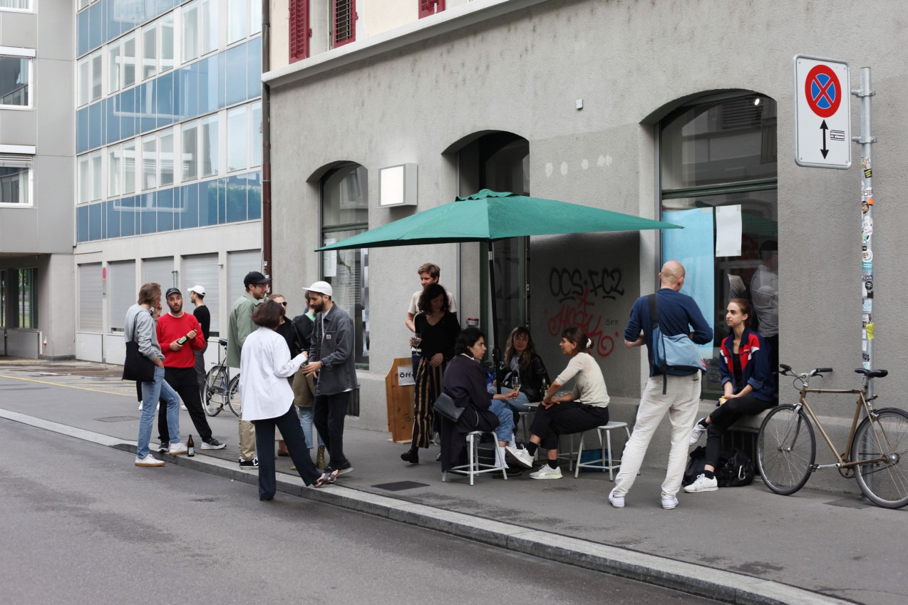
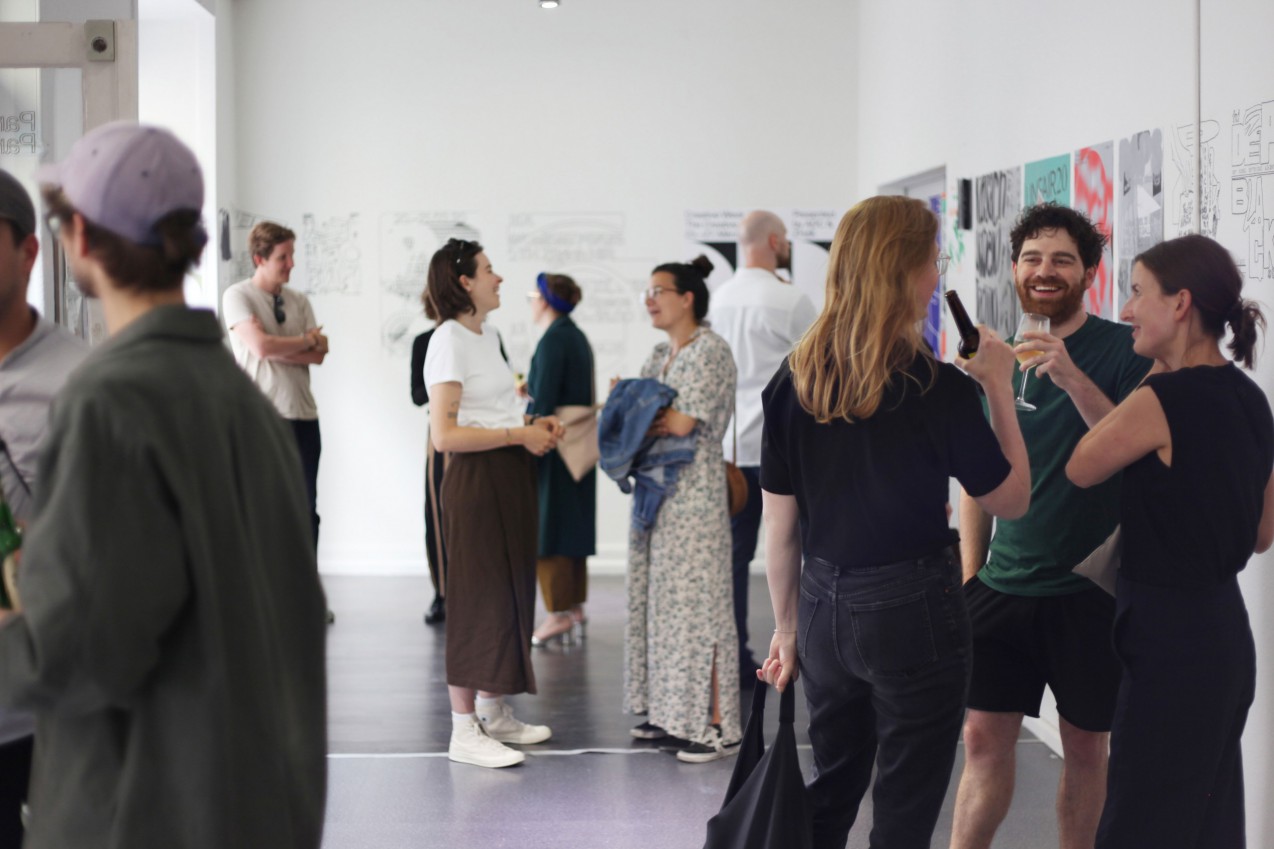
Opening : June 3rd, 18:30pm at The ÖFF (St. Jakobstrasse 54)
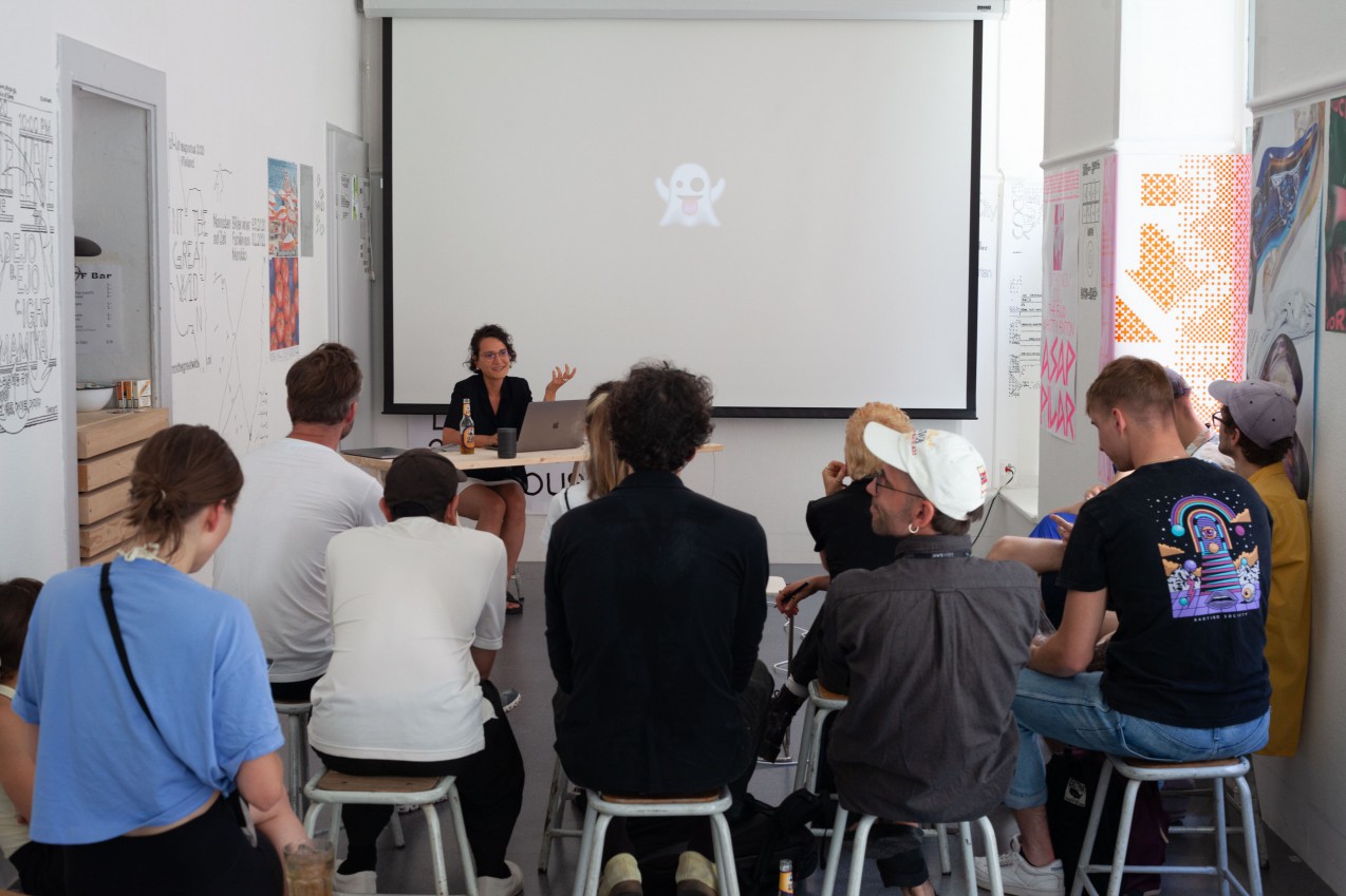
Lecture: June 4th, 16:00
OffShore Studio’s Isabel Seiffert, Turbo’s Mothanna Hussein and Stoecklin & Wilson’s Melina Wilson will be giving presentations about their ‘ghost’ works. The lectures will be presented in English.
Ortolan: June 11th,16:00
Kaj Lehmann and Nicolas Schaltegger will run «Ortolan», a pop-up bar with special cocktails

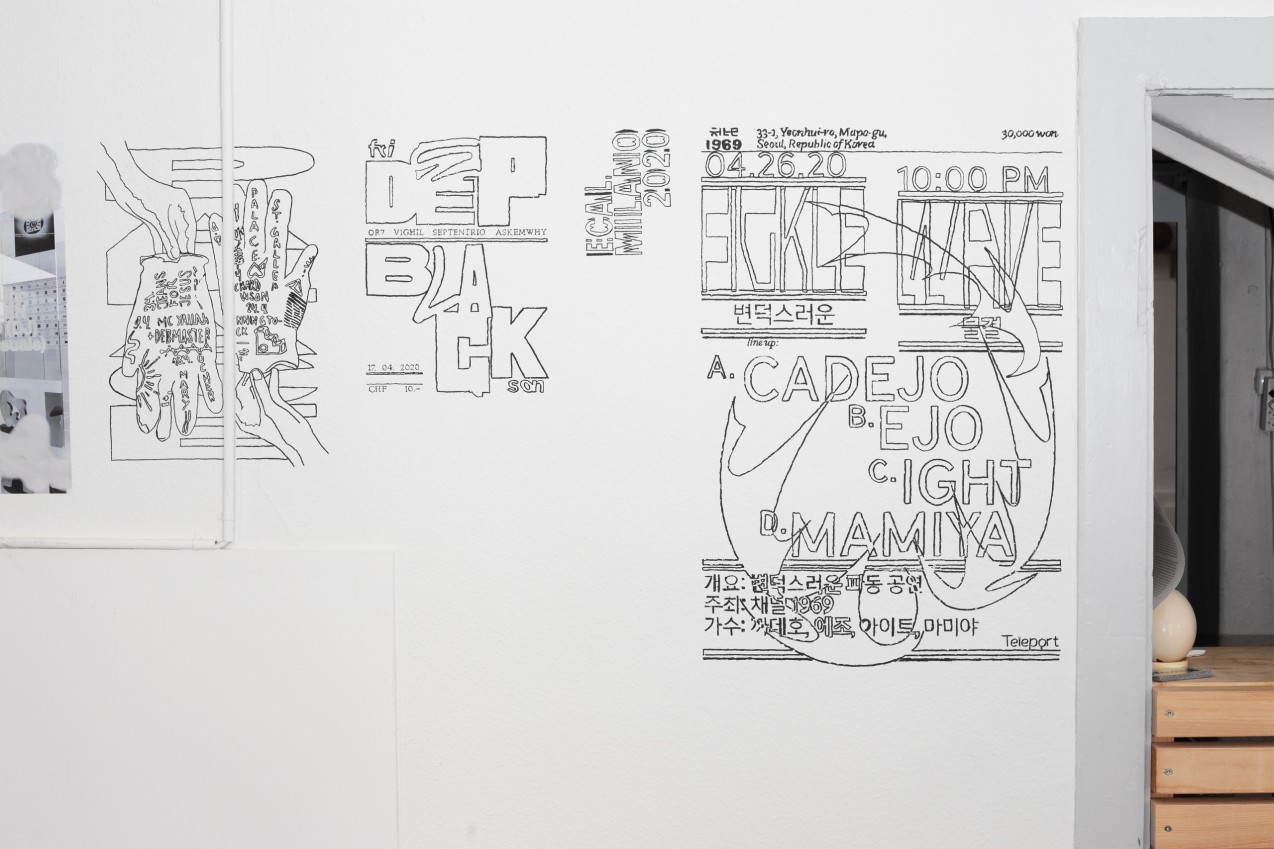
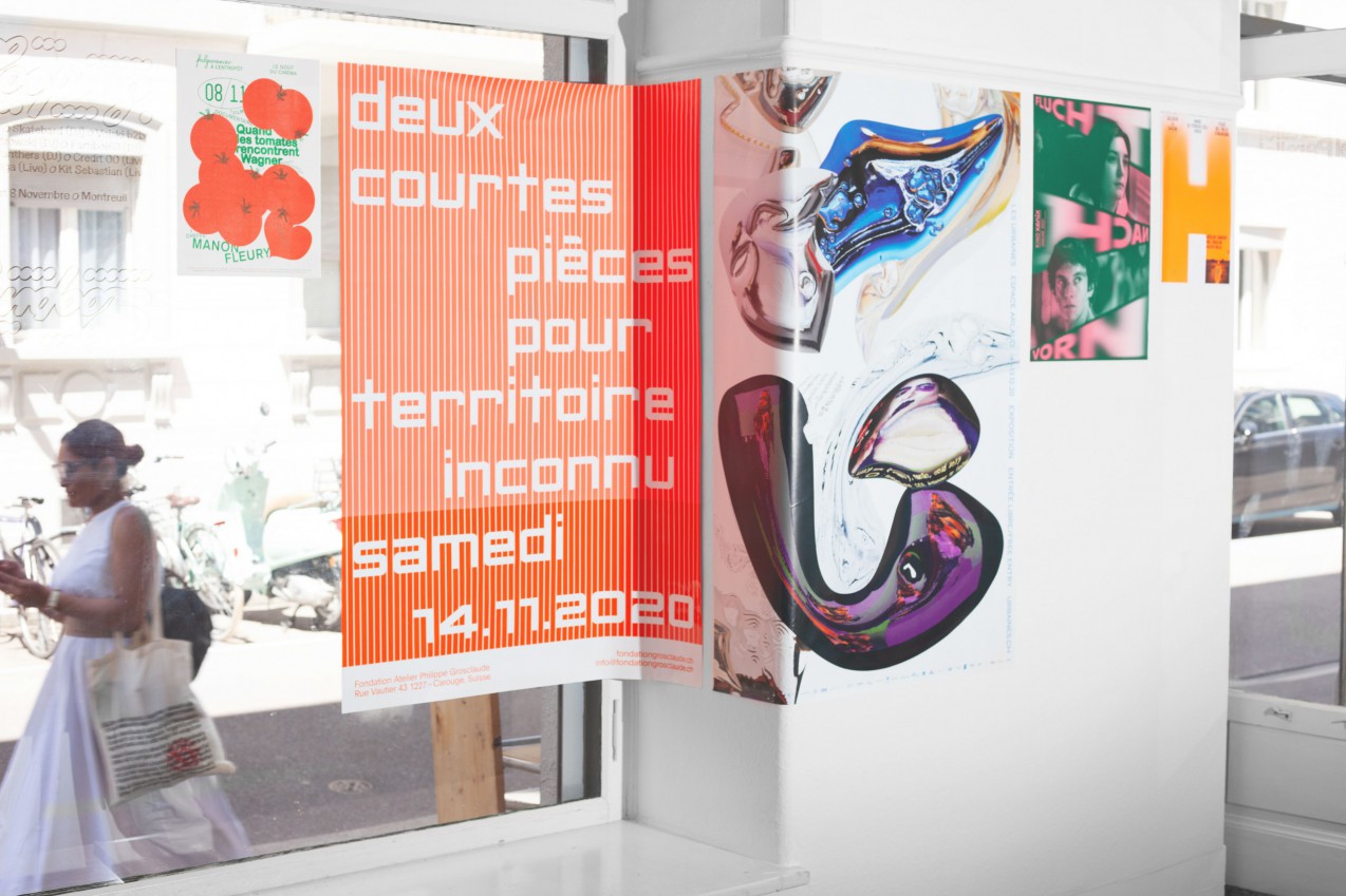
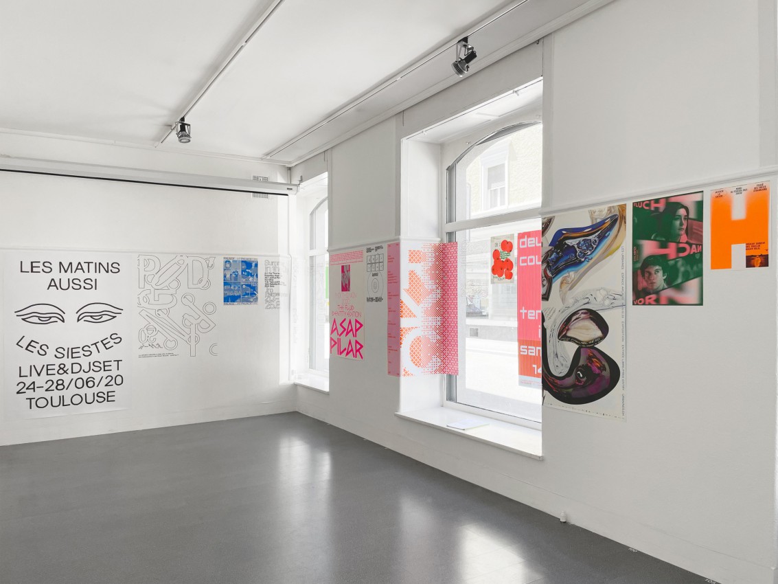
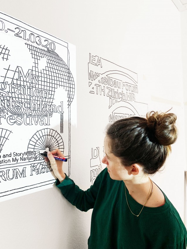
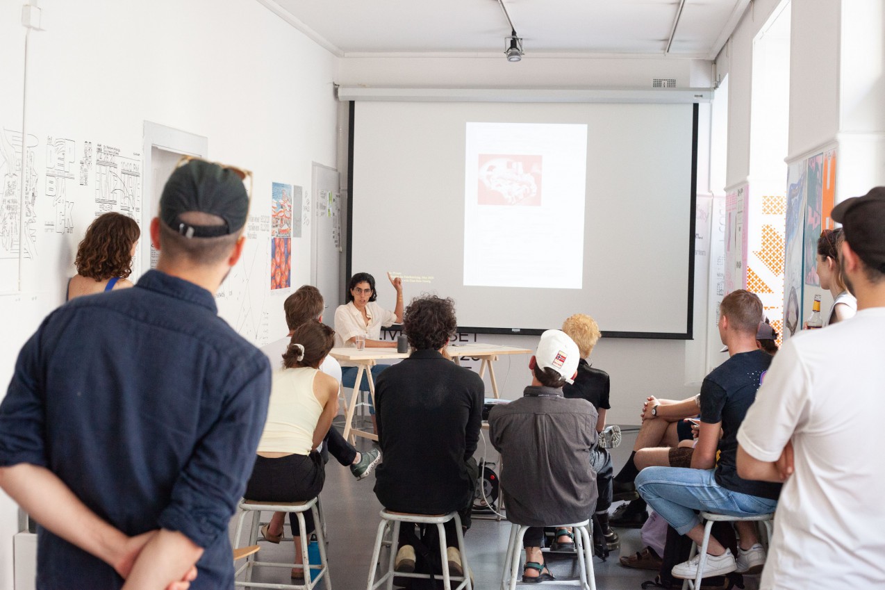
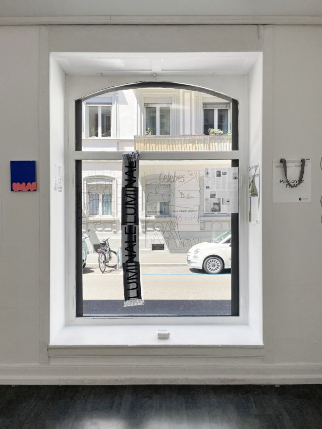
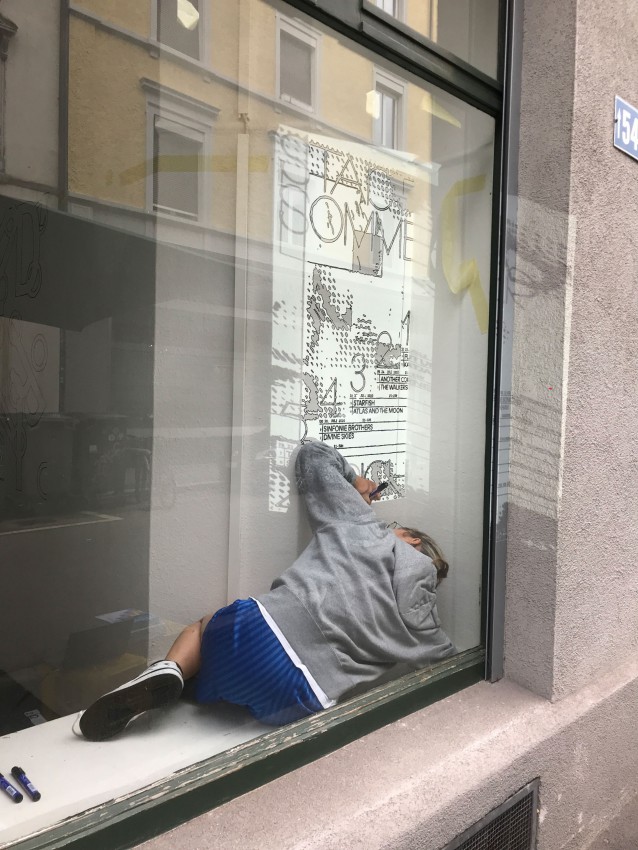
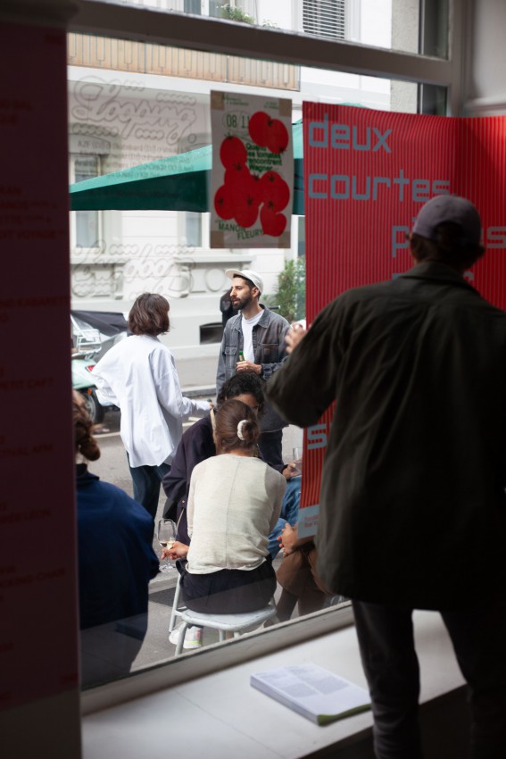
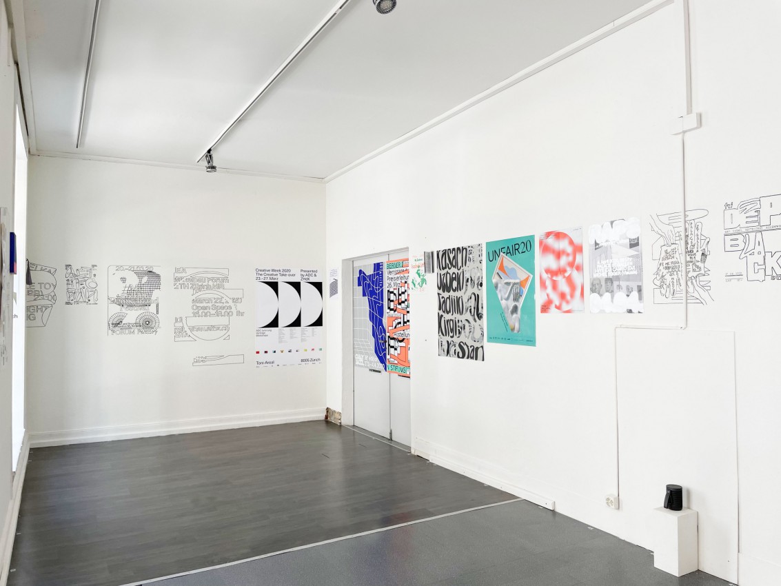
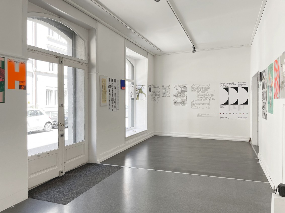
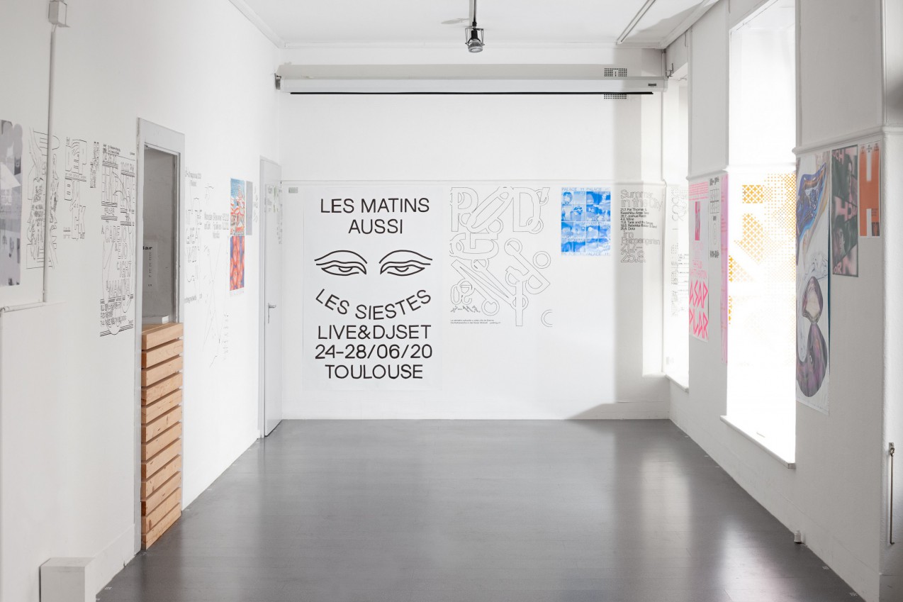
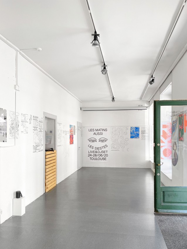
After two years of collecting projects, and showcasing them online, Parallel-Parallel became an in person exhibition. By showing a selection of works from the website, some produced and some not (drawn directly on the wall) we aimed to examine the different states of the graphic design practice, in other words, the process of materialization of the design object. How do we talk about and present the ‘ghost’ works that never left our computers or that remained in our minds?

Read more
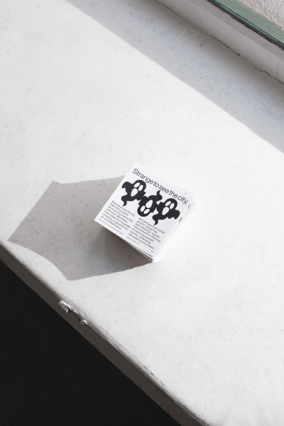
We are grateful for everyone who came to visit, who gave us their incredible space (Matthias Wyler and André Rothfuchs from Studio Sirup), who helped us install and draw (Coline Houtot), who wrote our introduction text (Andrea Salerno), who made ghost stickers for us (Experimental Jetset), who recorded our voice labels (Rhona Mühlebach), who shared so candidly and gracefully their ghost projects (Isabel Seifert, Melina Wilson), who made fantastic cocktails for our Finissage (Kaj Lehmann, Nicolas Schaltegger), while (@_thisislookah, @alpha_mi_, Flo Olomski) played the best music, who hosted us in their flat (Raphael Schoen), and of course all the designers who have been part of Parallel-Parallel. Looking forward to the parallel futures. 👻
Künstlerhaus Mousonturm

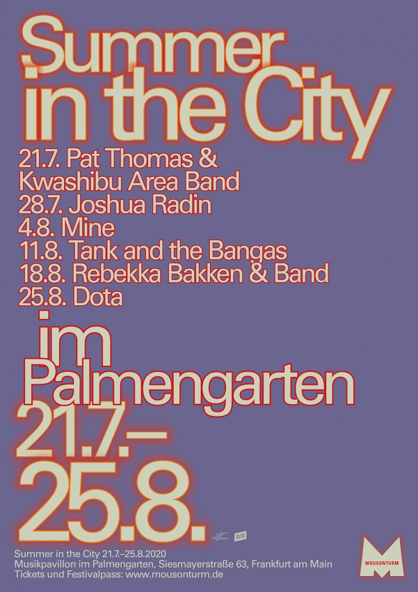
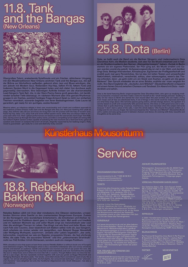
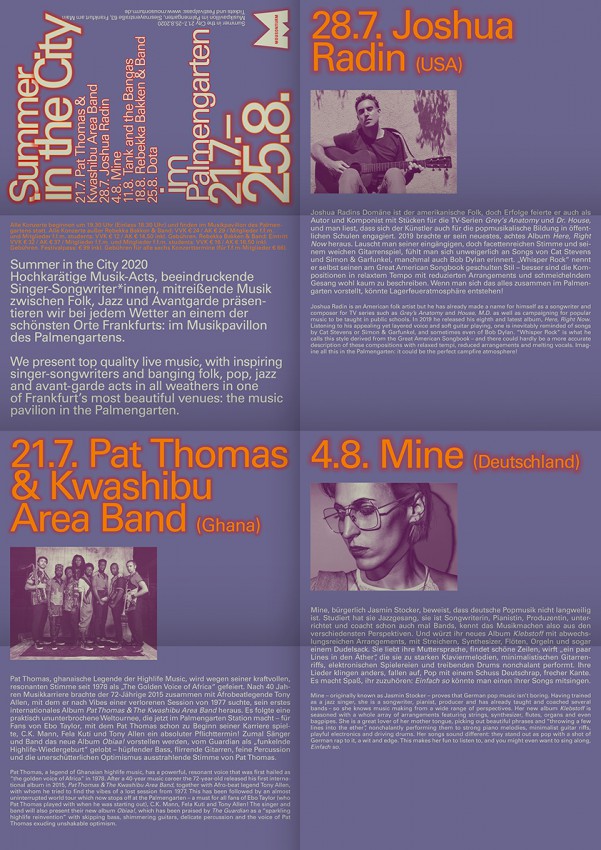
The poster and flyer were created for the event ‘Summer in the City’ by Künstlerhaus Mousonturm. A festival which presents singer songwriters, electronic artists and avant-gardists. It was supposed to be performed in Frankfurt’s Palmengarten.

Designer(s):
Anne Büttner, Berlin (DE)
Client:
Künstlerhaus Mousonturm, Frankfurt am Main (DE)
Share
Share
Share
Share
Share
Share

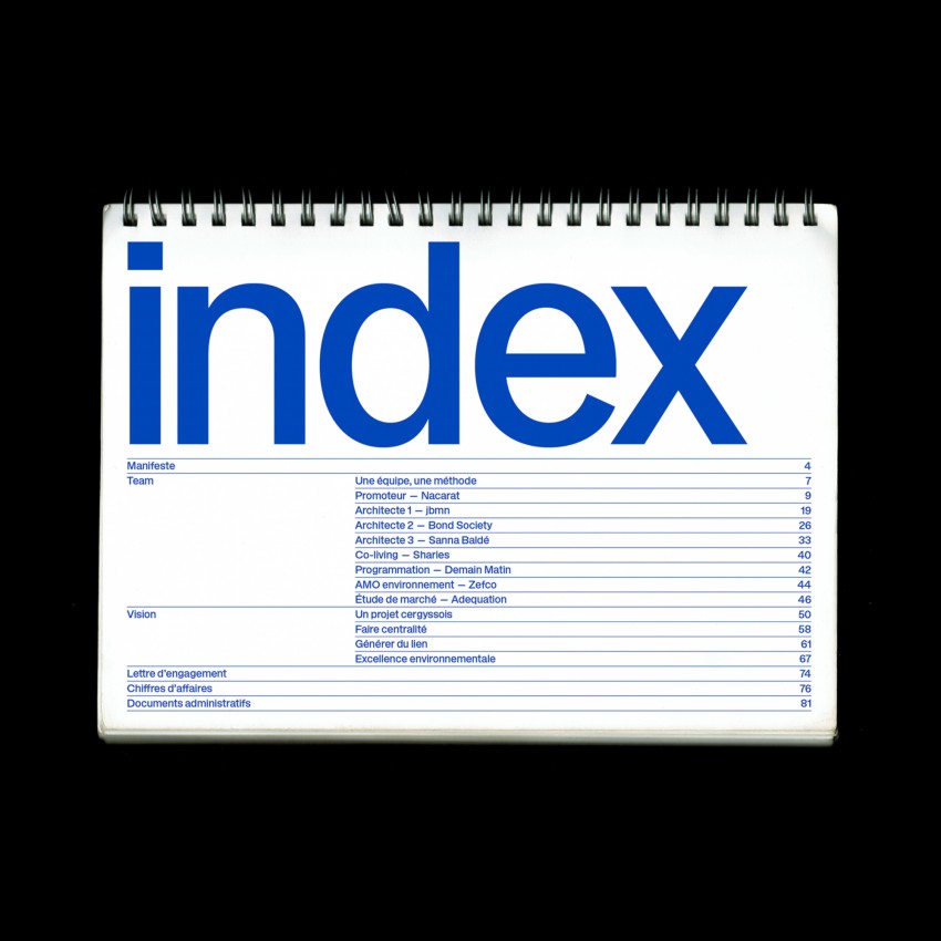
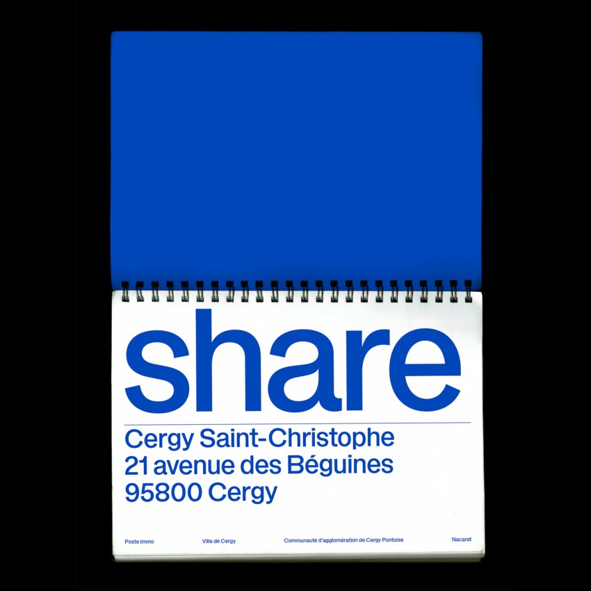
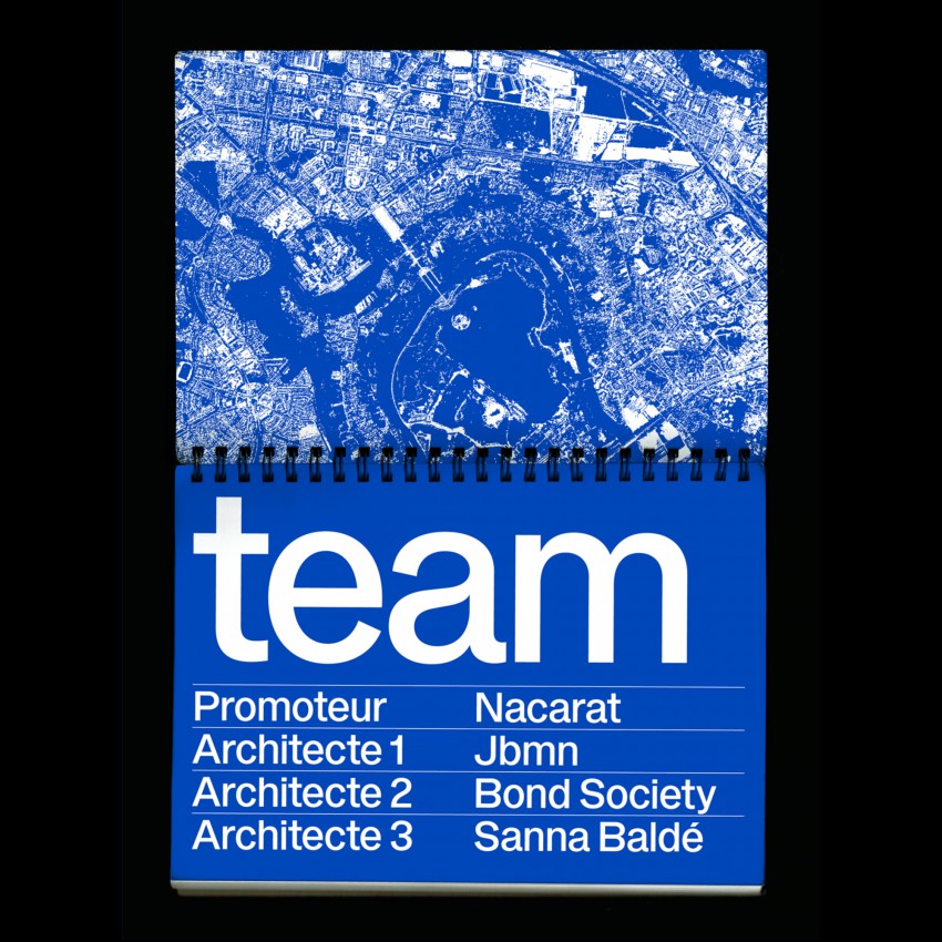
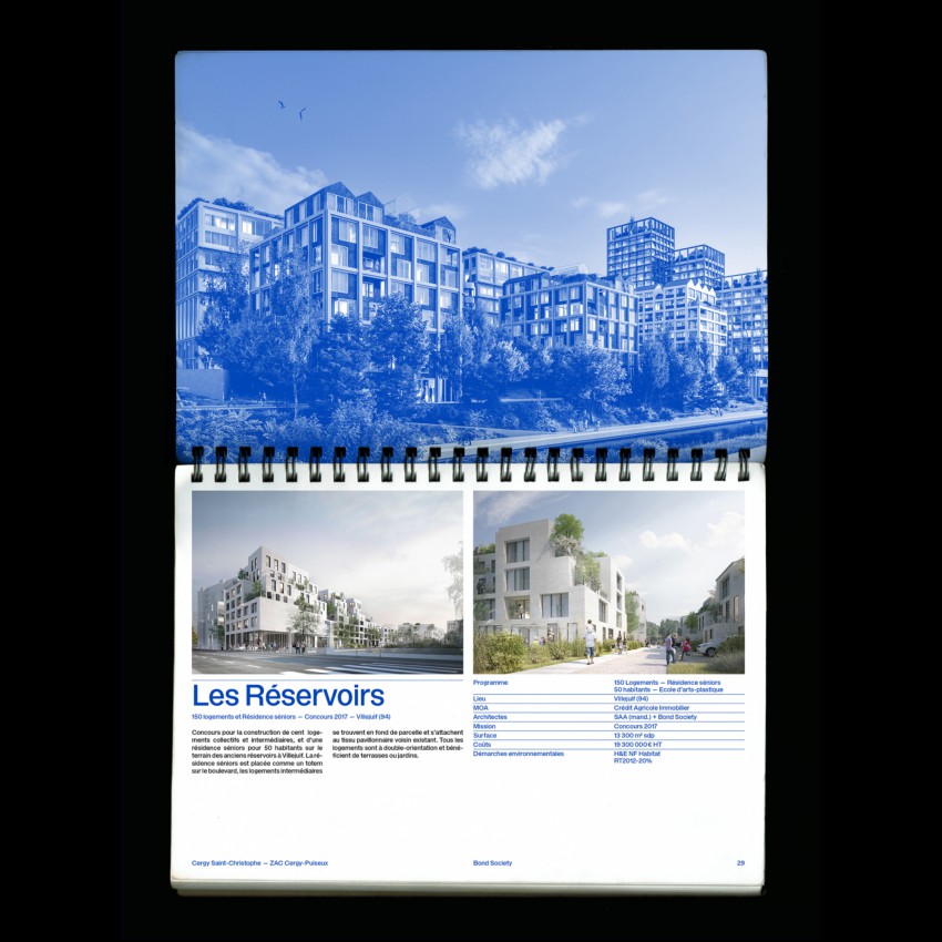
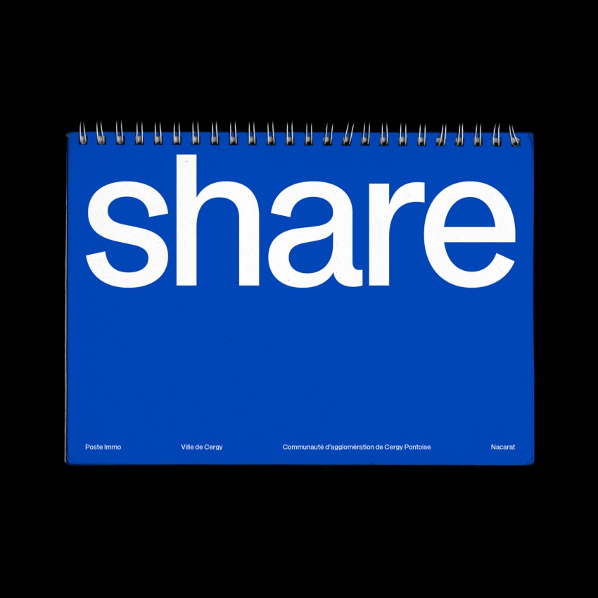
“Share” is a publication showcasing an architectural proposal for the city of Cergy. By connecting nature to architecture, the project envision new ways of living. One font, one weight, one Pantone. It should have been printed on paper, but because of the current crisis it was finally published as a pdf.

Designer(s):
Republique Studio, Paris (FR)
Client:
City of Cergy, Cergy (FR)
Rimowa
Rimowa

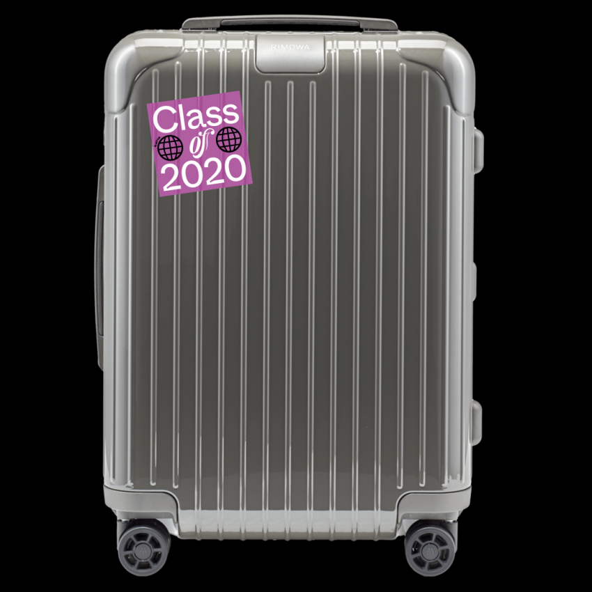
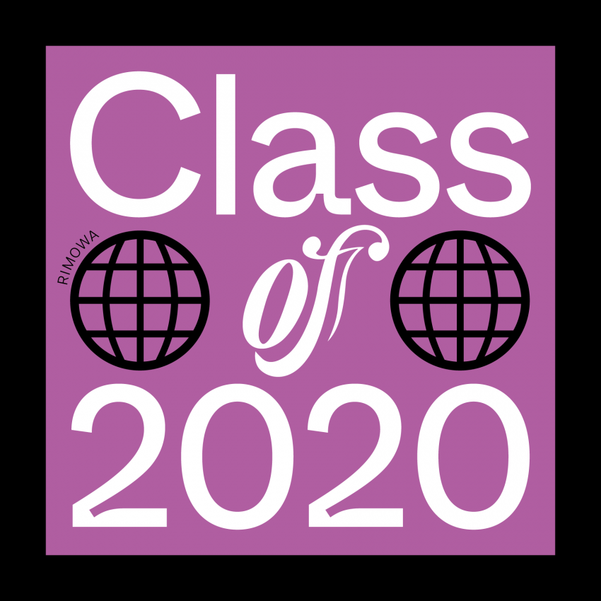
In March 2020, I was commissioned by RIMOWA to design a sticker for their luggage sticker collection. The theme was the graduation of the class of 2020, a transitional year on a worldwide level. ​​​​​​​Although the product did not hit the market, the experience of working for such a well-rounded team was fascinating.​​​​​​​ Unfortunately, this project was postponed due to Covid-19 first lockdown announcement.

Designer(s):
Filippos Fragkogiannis, Athens (GR)
Client:
Rimowa
Pillar
Pillar
Pillar
Pillar
Pillar

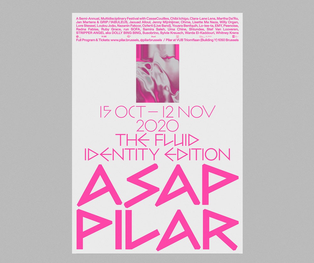
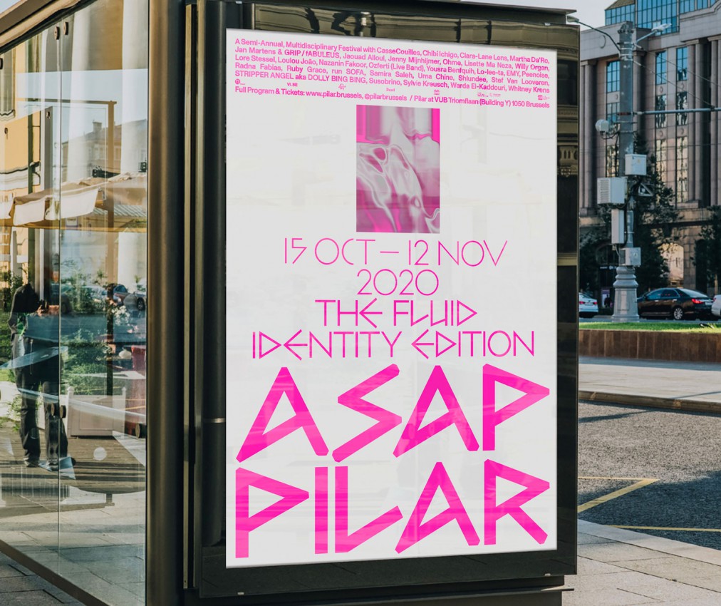
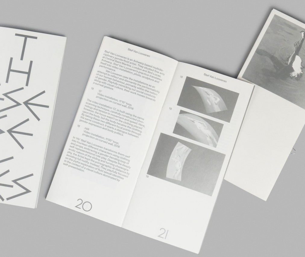
Pilar Asap is a semi-annual, multidisciplinary festival organized by Pilar in Brussels. This year’s edition was centered around the theme of identity. What does identity mean in music, art, performance and culture in our current times? The festival’s program had a long list of concerts, debats, lectures and performances. Unfortunately the festival was cancelled because of the second covid lockdown. Pilar is now trying to bring the Asap program in a digital revive, by the name of Pilar Asap Sessions. Keep an eye on their socials for more about this. You could still find the poster’s aftermath in the streets of Brussels in 2020.

Read more

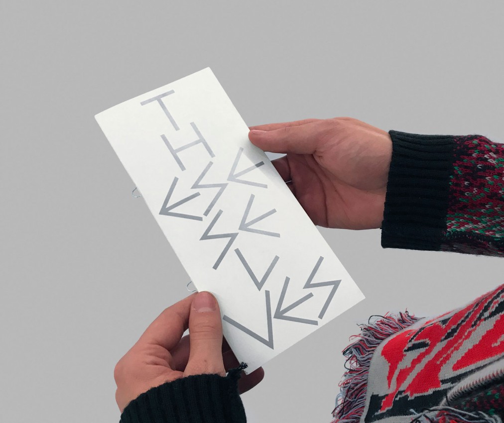
The series of these festivals is made in the unique identity of Pilar itself. For the identity of Pilar we wanted to find a font that visualized a dual association. On the one hand, we tried to find an association with the historical approach of the university and its old generation, which the art center is located on. And on the other hand, we wanted a rebellious and punk approach for the youth. These associations fitted perfectly with Max Bill’s typeface Bill (1950), named after himself. The typeface is based on the ancient cuneiform writing and is associated with ancient temples and the knowledge passed from ancient reading stones. Pilar, pronounced like “pillar” (meaning column) fitted perfectly with the idea of ancient temples. Apart from this ancient remembrance, we also thought the aggressive sharp lines felt like graffiti tags. A typical rebellious typographical expression of the youth throughout the years, mixing the visual language of the ancients perfectly with the contemporary of the youth. The content of the identity is always centered, leading to a stack of graphical form. This graphical form represents a pillar of content. Every edition Corbin & Lennart create a theme-based image and animation and select a connected color.

Designer(s):
Corbin Mahieu & Lennart Van den Bossche, Ghent (BE)
Client:
Pilar, Brussels (BE)
Palace 2
Palace 2

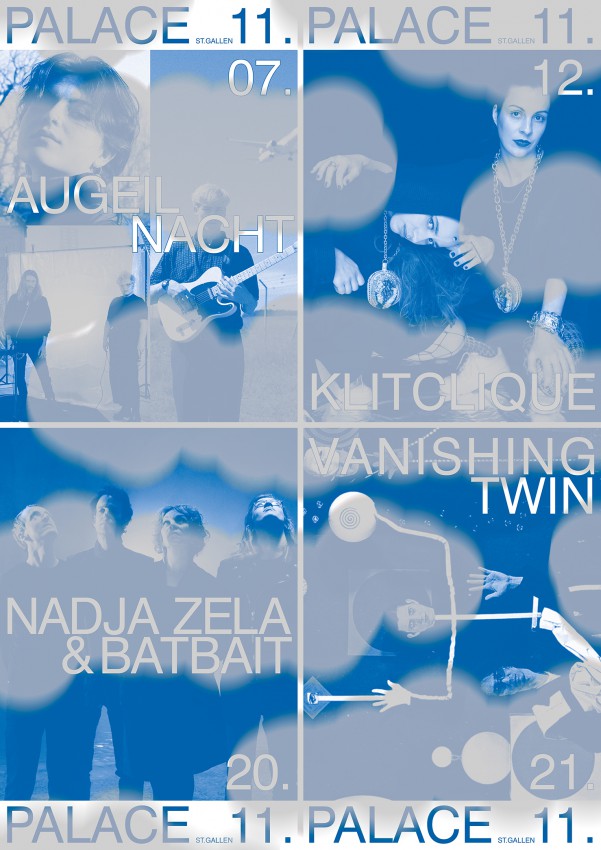
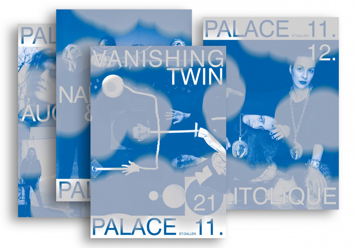
On the one hand, in the hope that as many events as possible could be held, but with the ulterior motive that some might have to be cancelled, I wanted the poster to be able to be used sensibly in any case. So I designed it in such a way that the poster could be cut into 4 parts and thus at least the valid events could still be advertised with it… The poster was printed with two pantone colors—blue and overprinted with silver—nevertheless, optimism unfortunately did not pay off in this case: all four events had to be cancelled.

Designer(s):
Anna Haas, Zurich (CH)
Client:
Palace, St. Gallen (CH)
Audace(s)
Audace(s)
Audace(s)
Audace(s)

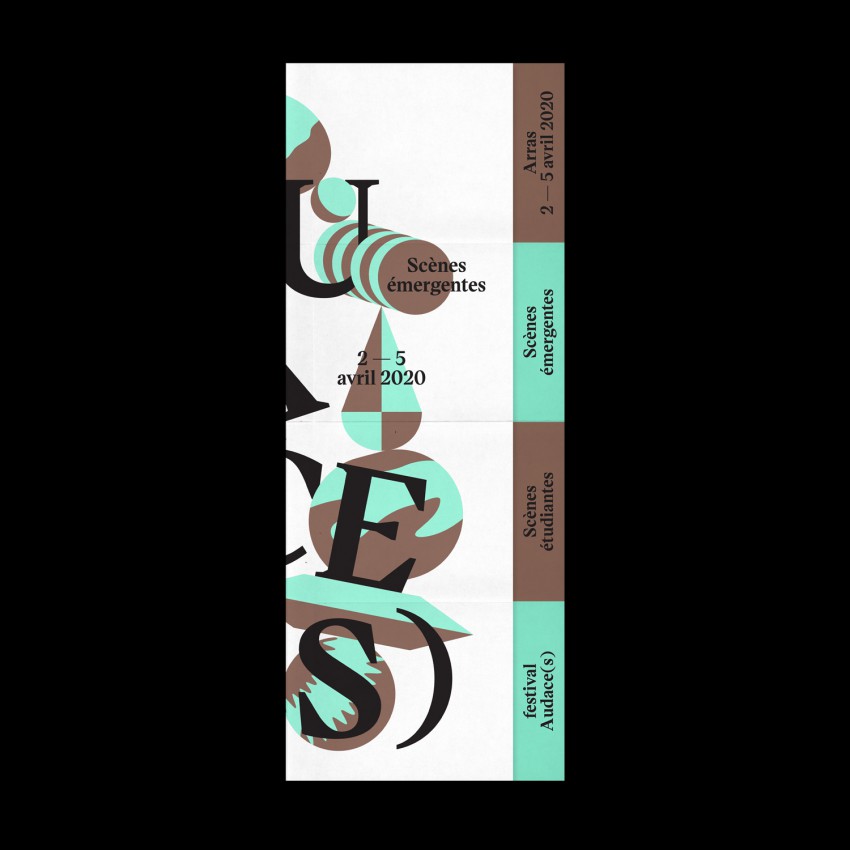
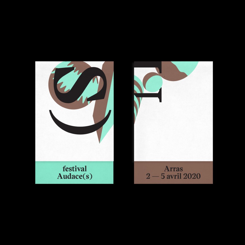
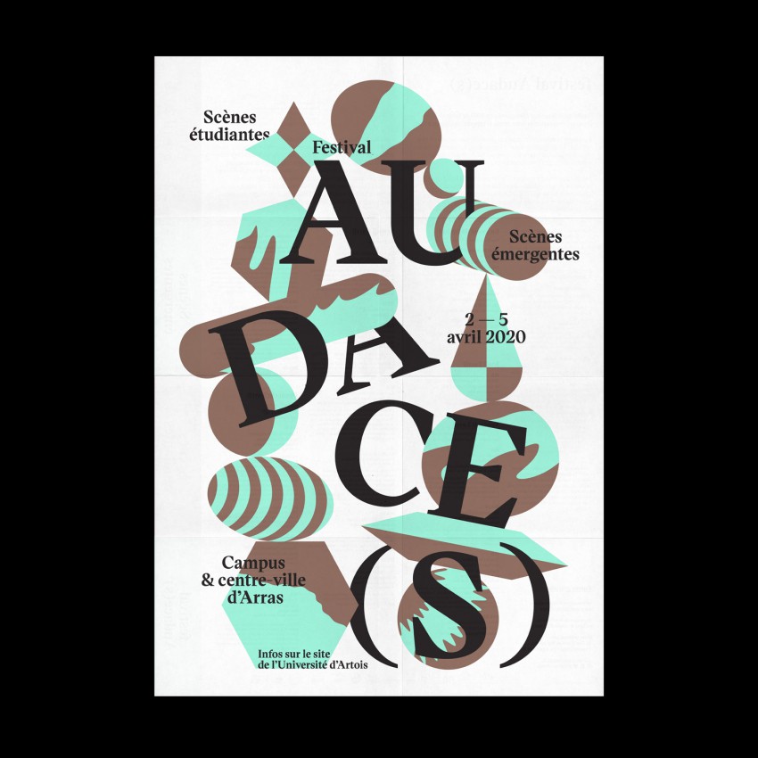
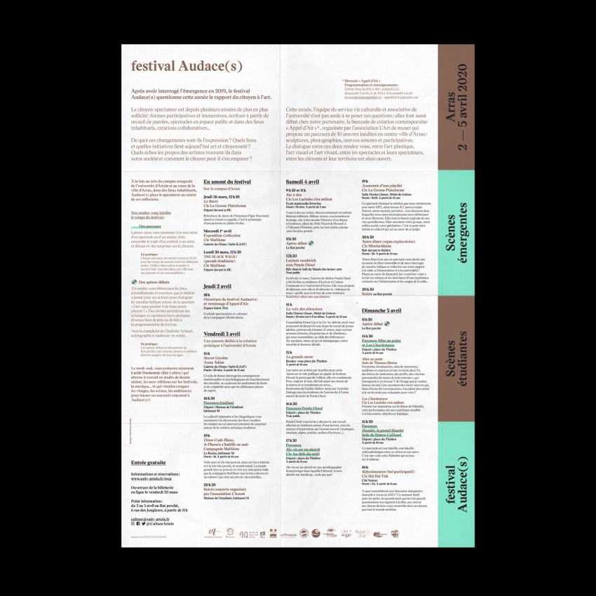
Last April the second edition of the Audace(s) festival—dedicated to performing arts through the prism of emerging and student scenes in Arras—was supposed to take place before this you-know-what19 mess happened.
This year edition was based on a visual fragile balance as a metaphor for the risk-taking of experimental artistic practices. Sadly, we couldn’t be more right and it seems everything fell apart.

Designer(s):
Surfaces Studio (Nicolas Millot, Jane Secret), Lille (FR)
Deep Black

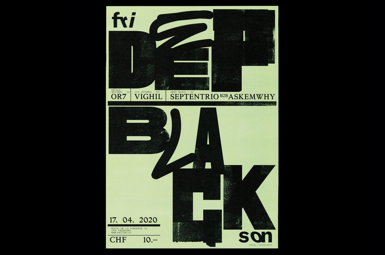
This is the second of a poster series for the Deep Black events that take place in Fri-Son (Fribourg), which are organized by Lausanne-based DJ’s Askemwhy and Septentrio. The parties were described as follows: “No Light, No VJ, Just Bass.” The theme is represented through this heavy and bold typographic composition, in which I tried to achieve a black ink on letterpress effect. The event was firstly planned for April, then was postponed to November, and will obviously be moved again.

Designer(s):
Nathan Meyer, Zurich (CH)
Client:
Fri-Son, Fribourg (CH)
Beer
Beer

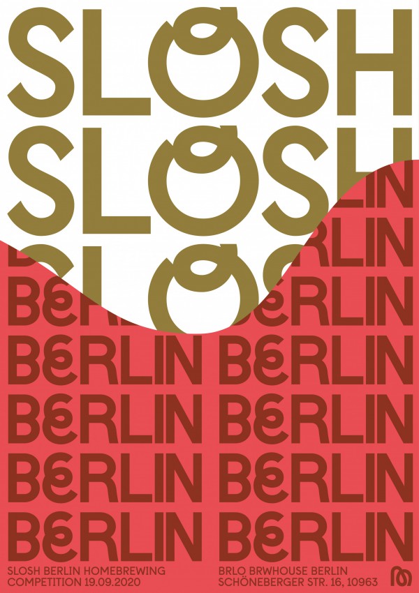
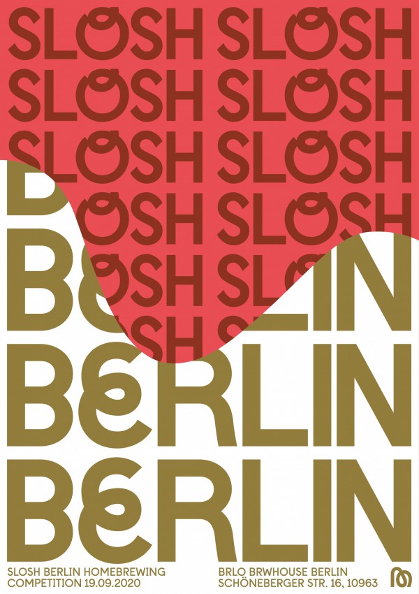
Posters to promote Slosh Berlin, Berlin’s annual homebrew competition organised by The Mash Pit Brewery. It is an amazing opportunity for all homebrewers in Berlin and beyond to showcase what they do best, brew beer. Thankfully the event still went ahead but on a much smaller scale than previous years due to Covid. This meant these posters were never printed and never saw the light of day.

The posters are designed to be tiled side by side and create a constant sloshing wave graphic. The posters were to be printed in a metallic gold with a vibrant pink/red. The saying ‘to get sloshed’ is slang for getting drunk, and also the movement of liquid.

Long live the Mash Pit!

Designer(s):
Callin Mackintosh, London (GB)
Client:
Mash Pit Brewery, Berlin (DE)