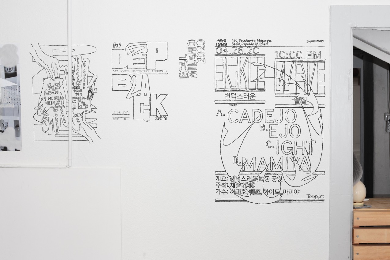
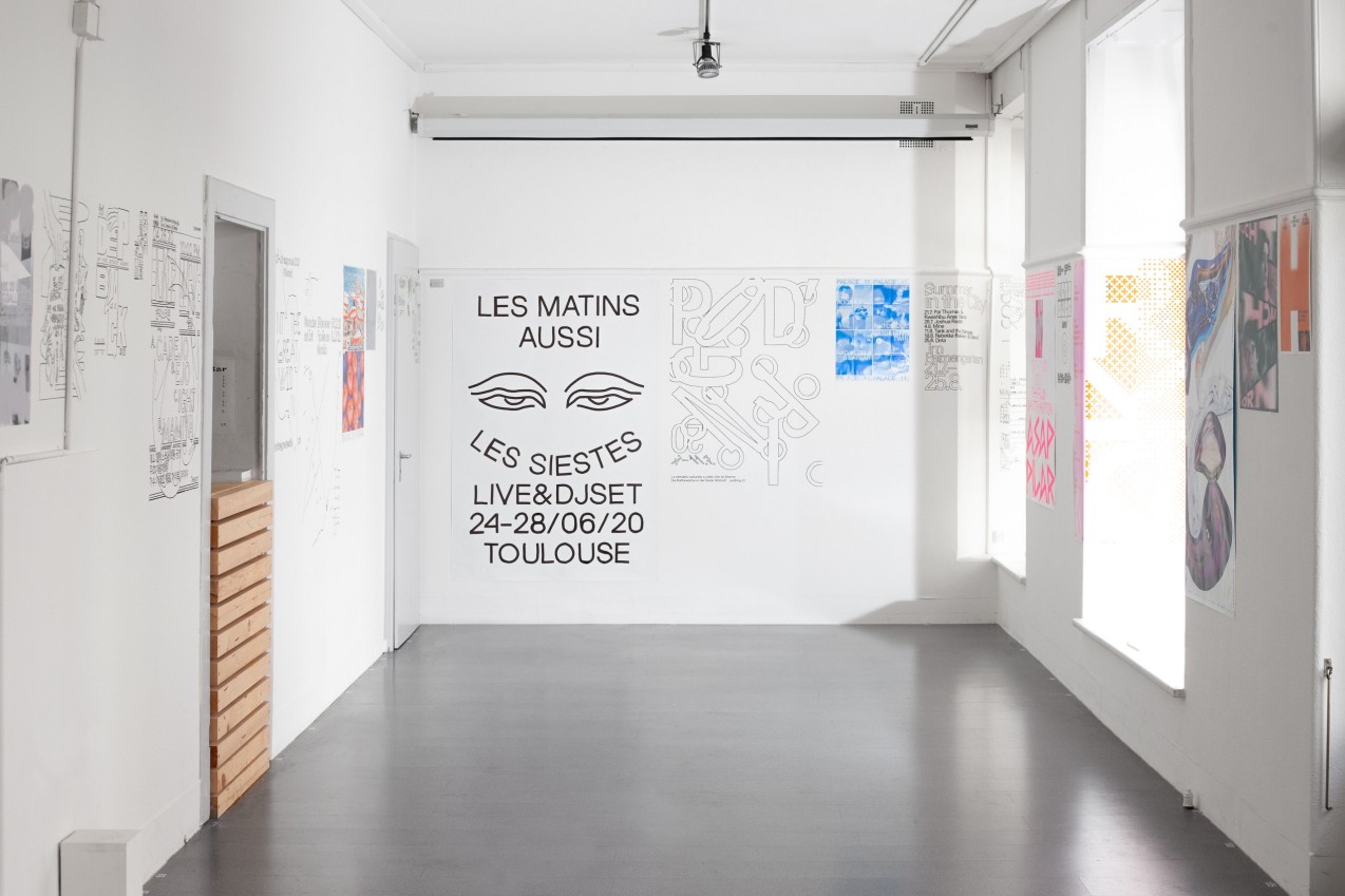
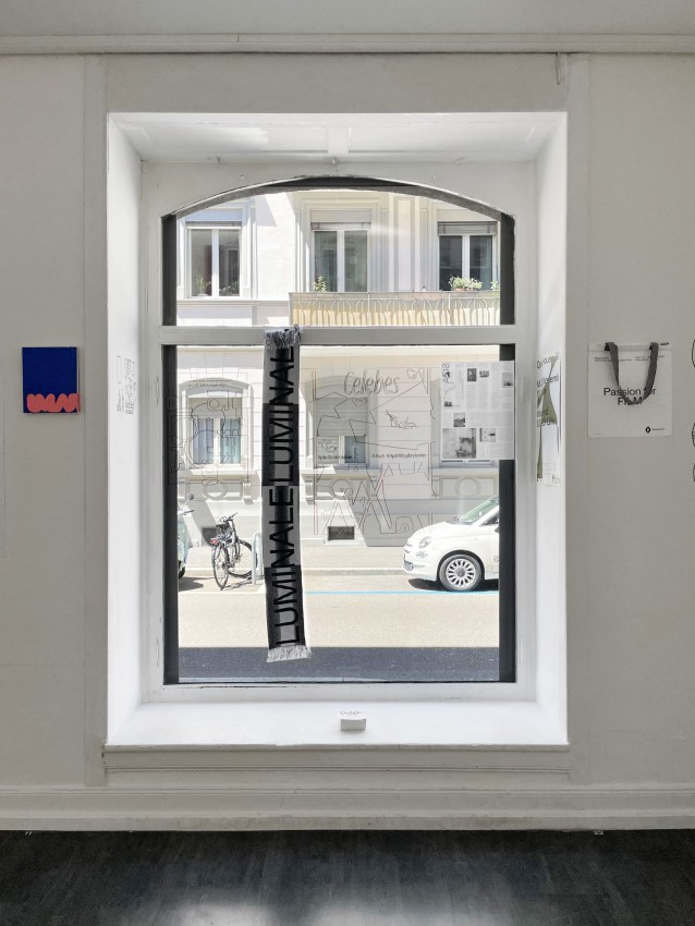
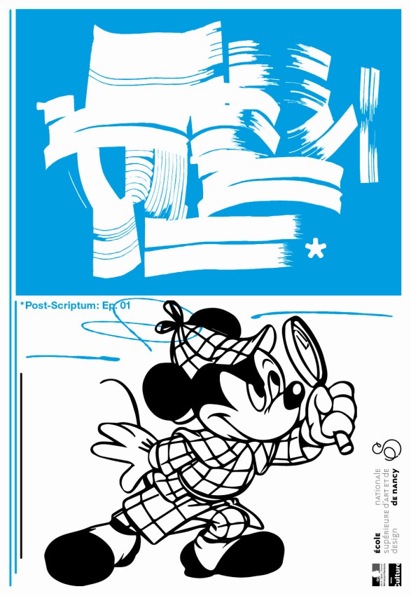
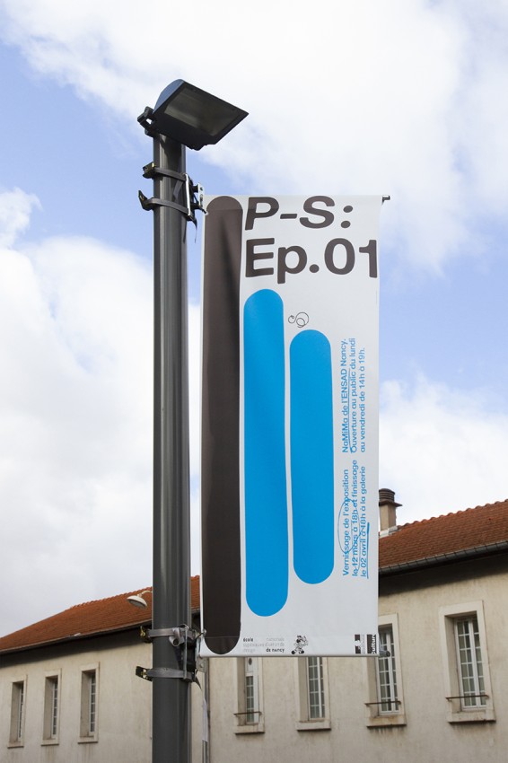
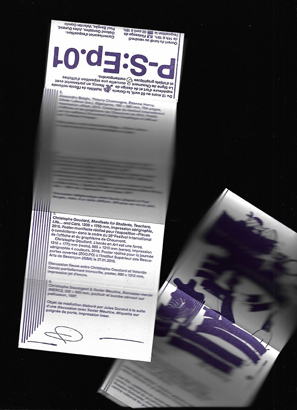
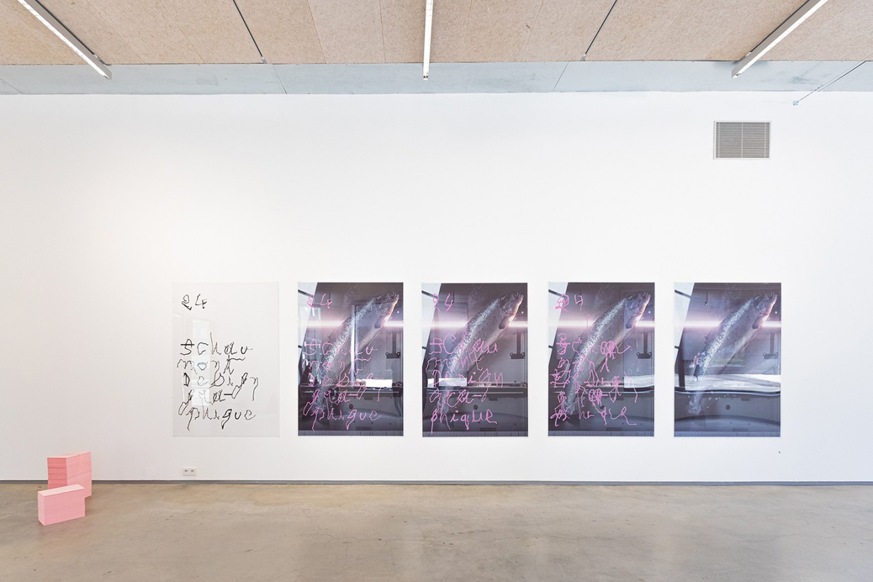
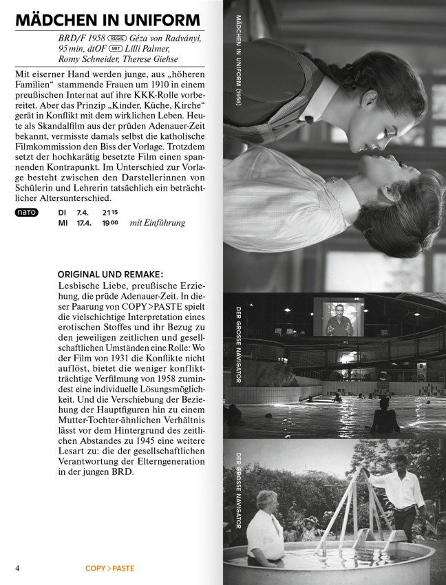
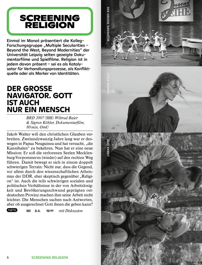
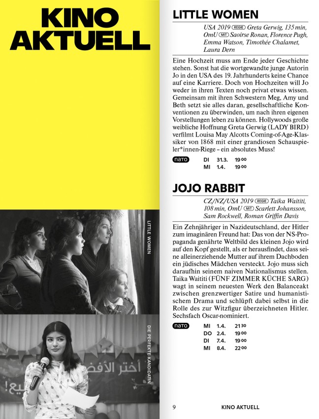
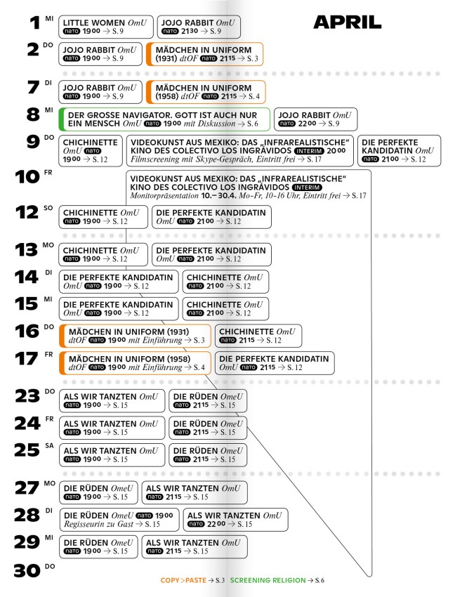
Parallel-Parallel is a gallery of works by graphic designers that
a) have been postponed indefinitely,
b) will never be realized or published,
c) were published for an event that will never take place because of this damn virus.
We believe that graphic design plays with potential realities and with this current crisis we want to see what has been left, on pause, in your hands.
If you are a graphic designer and have been working on a project that fits this description please reach out to us via:
email@parallel-parallel.com
We are looking forward to hearing from you,
your fellow designers,
Dorothee Dähler & Yeliz Secerli
PS: This website is programmed by Quentin Creuzet!