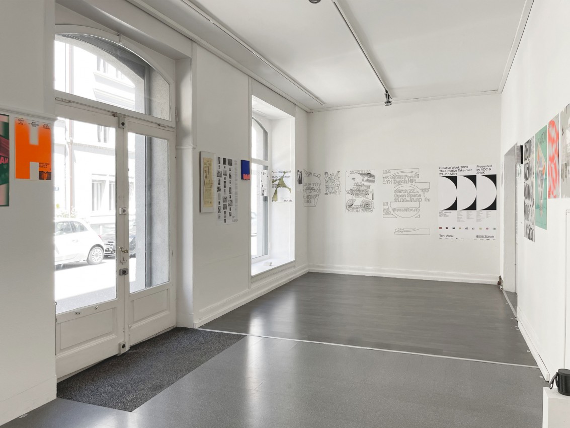
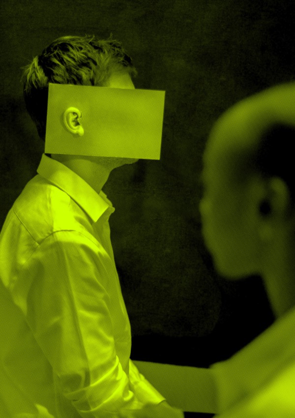
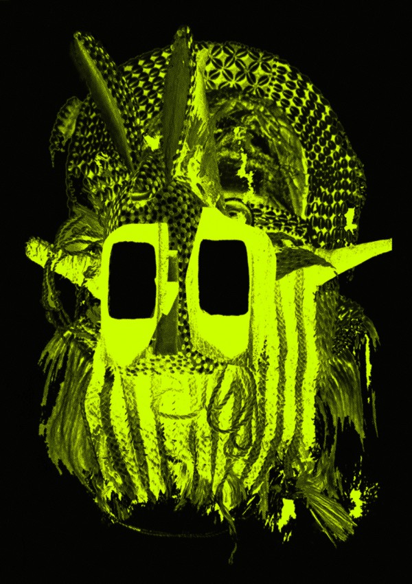
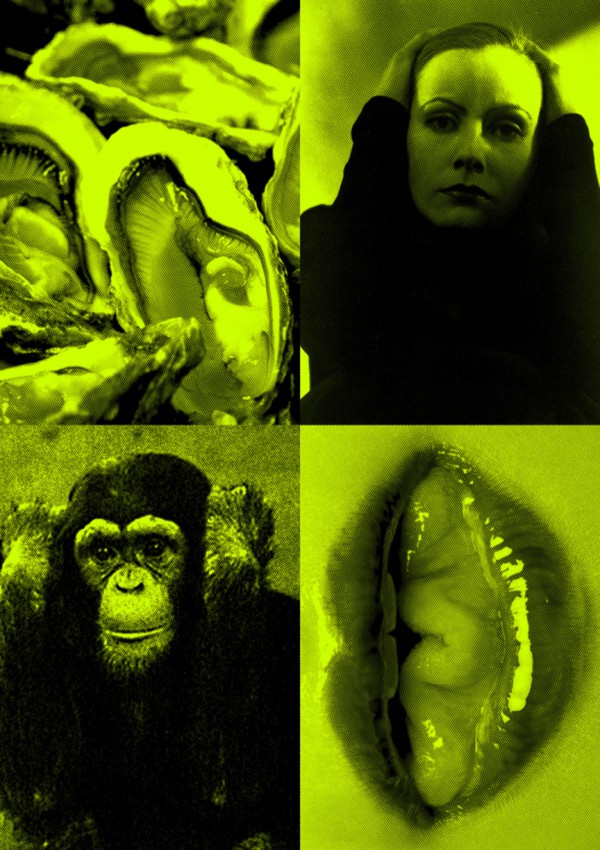
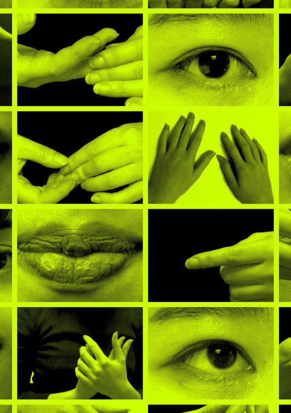
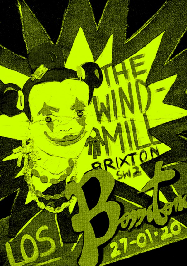
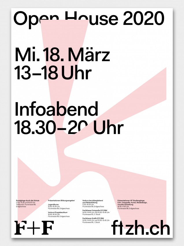
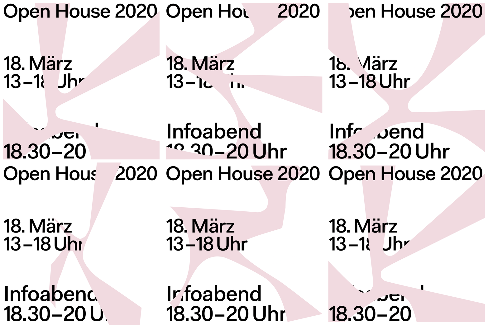
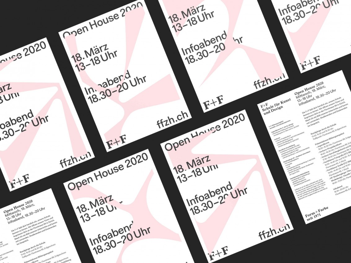
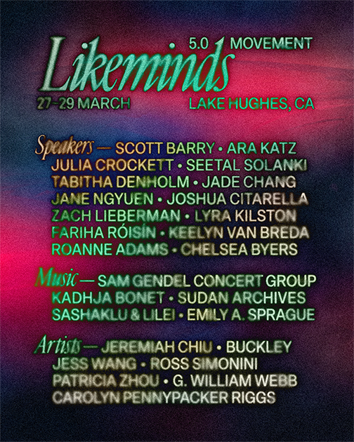
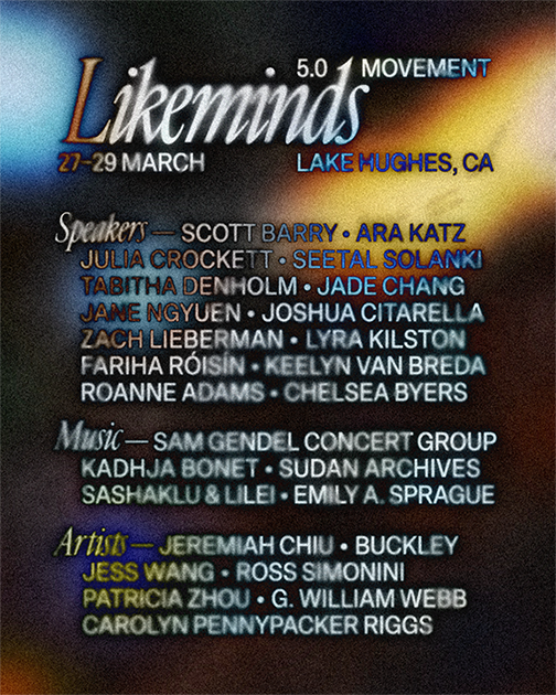
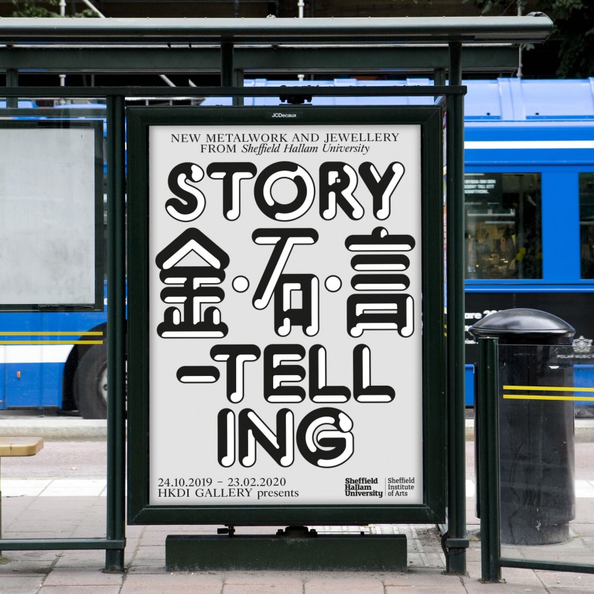
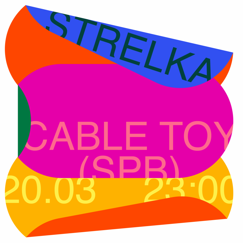
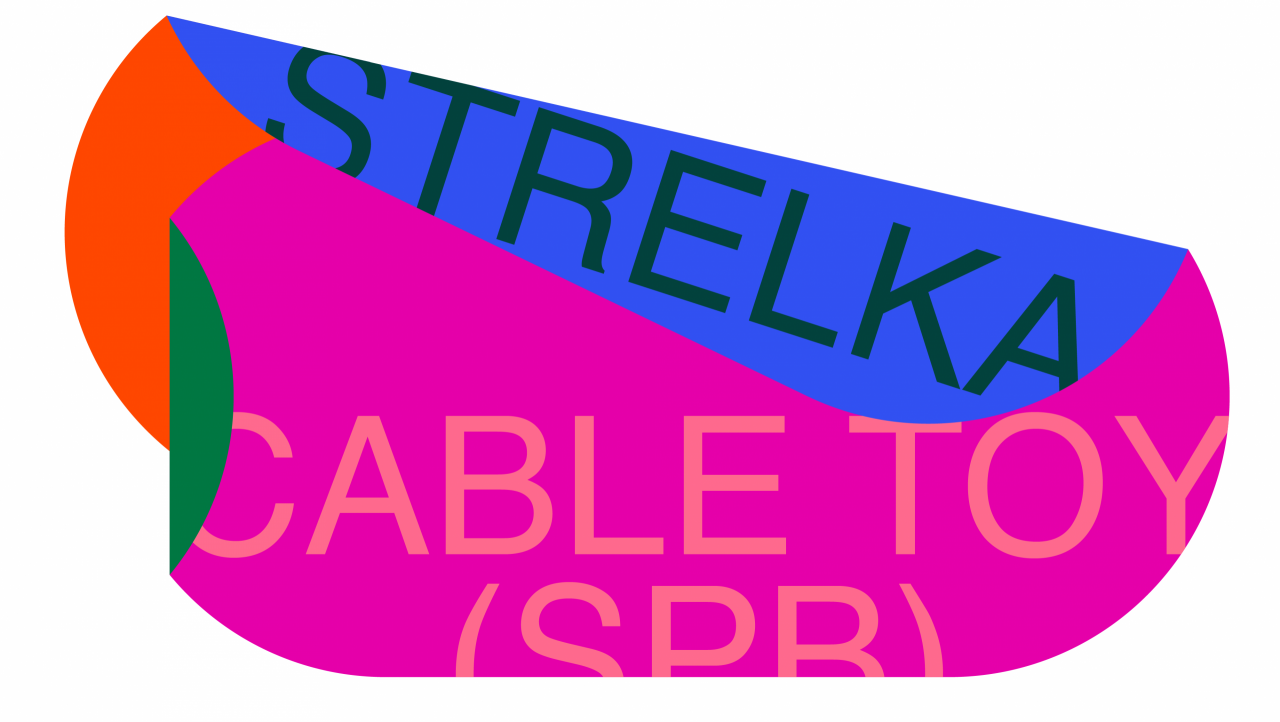
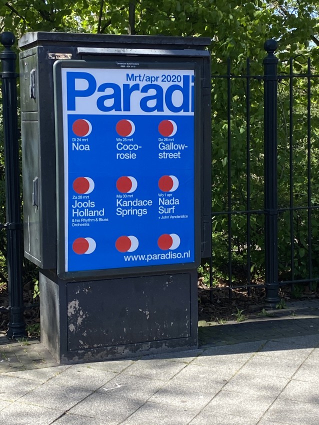
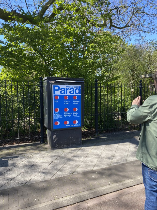
First a disclaimer – the poster shown above is not designed by us. We created the template for it, a couple of years ago. In fact, we designed the first templates for Paradiso already in 1996; and throughout the years, we revised these templates a couple of times – until 2016, when we turned it into a full graphic identity (or graphic language, as we prefer to call it). In other words, this particular poster was produced by the in-house graphic design team of Paradiso (Sander Puhl, Ilse Solleveld – who are always doing a wonderful job) – and whenever we see these posters in the streets, we still feel very connected to it.
Read more
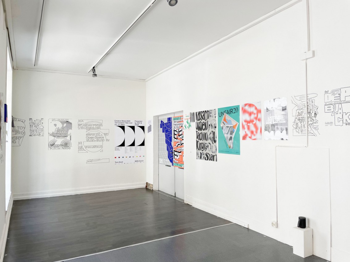
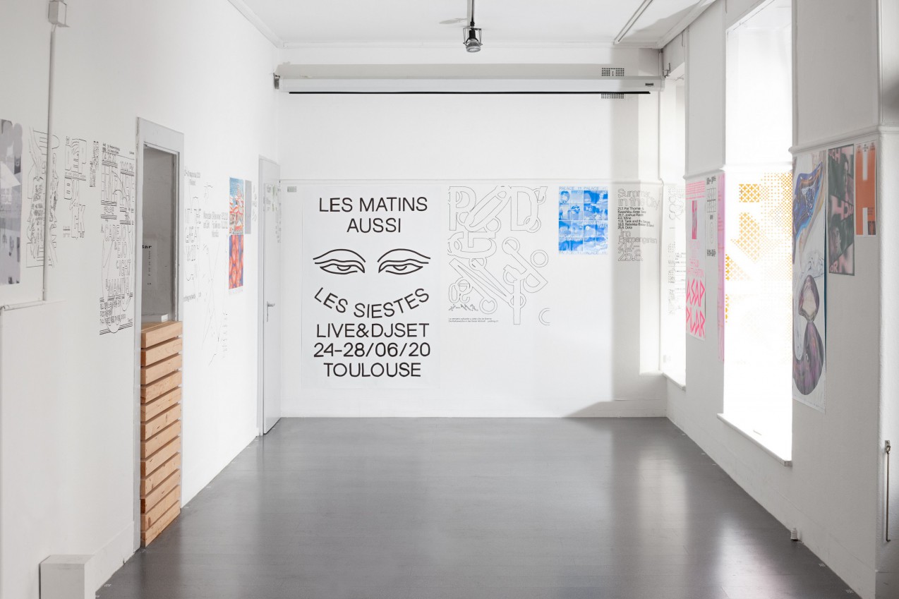
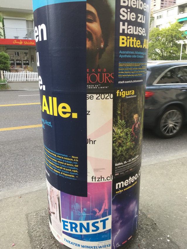
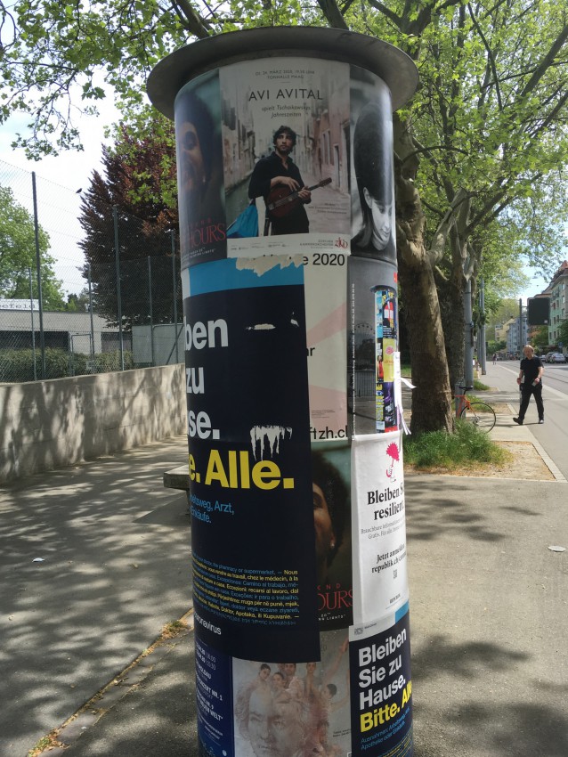
This poster is hanging in the streets of Amsterdam right now, together with loads of other posters from other venues, theatres and cinemas – all announcing concerts and festivals that will never take place. Together, these posters form a utopian web of impressions, sketching a future that never happened. There’s a certain beauty in that – to us, it shows the resilience of printed matter in times of crises, even when it seems to be failing.
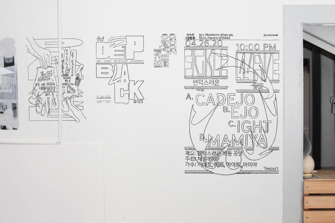
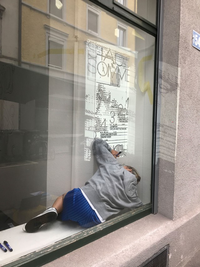
Here’s a street artist we recently came across, who actually feels less positive about this current notion of ‘cancel culture.’
And yet – we feel there’s a utopian power to be found in these outdated posters.
Let us explain:
Every day, we walk to the studio. This is perhaps a stupid thing to do, during these lockdown days – we know we should stay home. But we do need the walk (as vegans, a daily dose of sunshine is the only way to get our intake of Vitamin D – that is our feeble excuse) – and in the studio there’s only us three, and we’re basically family, so we feel it still counts as isolation….
So we’re walking to the studio, every day, through the ghost town of Amsterdam…
And while walking, we’re always really aware of the ecosystem of posters in the streets:
On the one hand, there are all the posters of events (mostly concerts) that are cancelled.
They appear as strange notes from a future that never took place – a surreal glimpse into an utopian parallel universe:
Dreamy, idealistic visions of tomorrow.
On the other hand, there is a whole infrastructure of urgent notes and flyers, taped and tacked to shop windows and restaurant doors…
Dystopian notes that say ‘Closed’, ‘Take-out only’, ‘Delivery only’, ‘Keep your distance’, etc..
And somehow these two infrastructures of posters (the utopian and dystopian) bleed into each other – they shift alongside each other, like two alternating rhythms, creating a sort of third rhythm… like a moiré of two different patterns.
This whole clash of rhythms generate a vibrant experience in the city – walking through the streets feels like surfing these printed, paper waves.
It also presents two different models of what graphic design can be:
It can be about envisioning better futures, in a utopian way. It can also be about the urgency and dystopia of the present. Both models are valid – they feed into each other, and need each other, like yin and yang.
Utopia and dystopia crashing into each other, like paper waves on a concrete shore.

