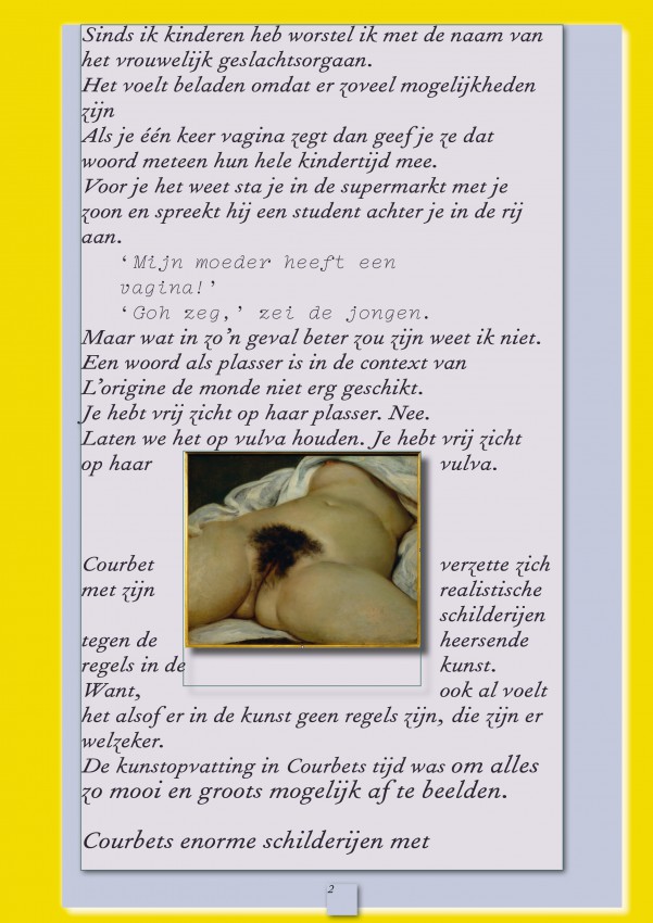
Weefsel (Tissue) was one of those ‘file under meaningful’ projects. It was a publication for Dutch artist, Ine Boermans, who started writing a few years ago because of health challenges. Her personal essays about her relation to art, making art, and (art) philosophy, mainly got published in online magazines and occasionally in print. Weefsel would be her first independent publication and was made possible by The Mondriaan Fund. (a national fund for the arts) It would merge her writing into one personal, new super-essay on art and would appear as a one-off free magazine.
Read more
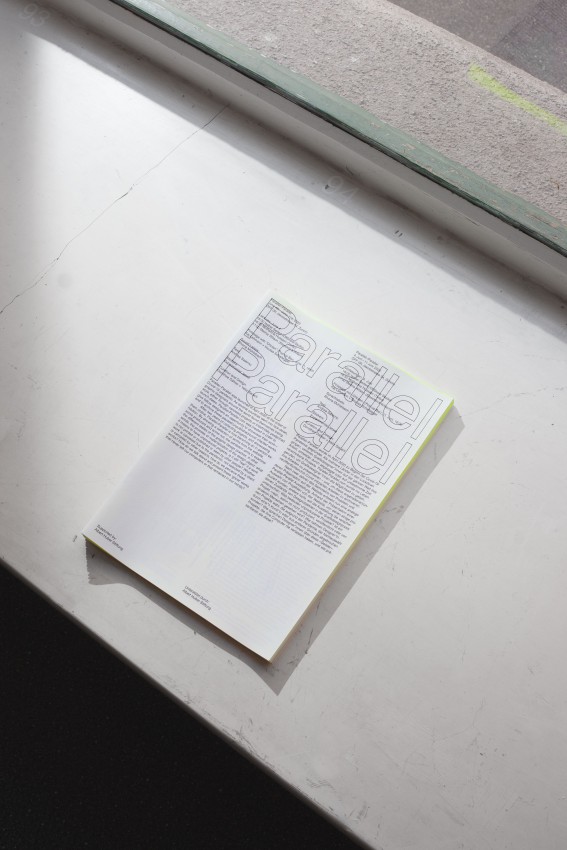
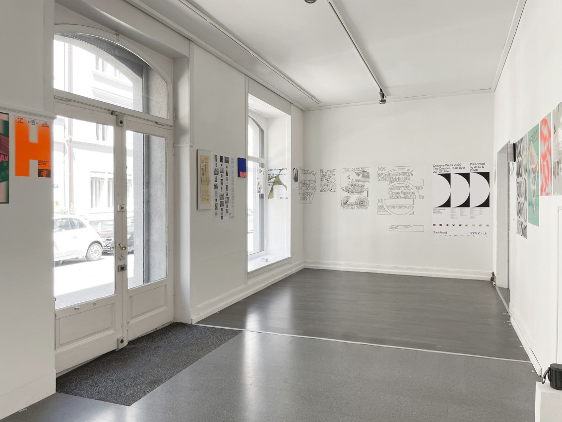
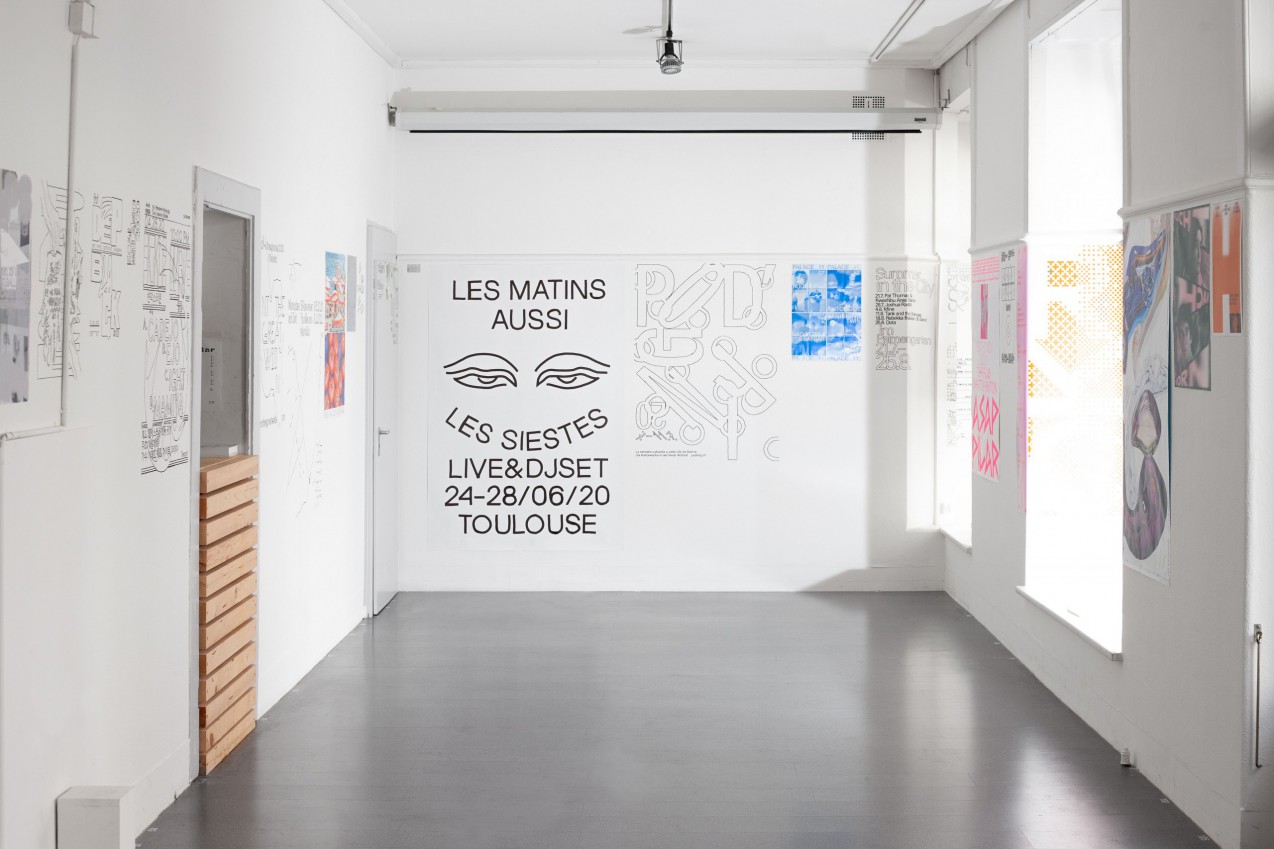
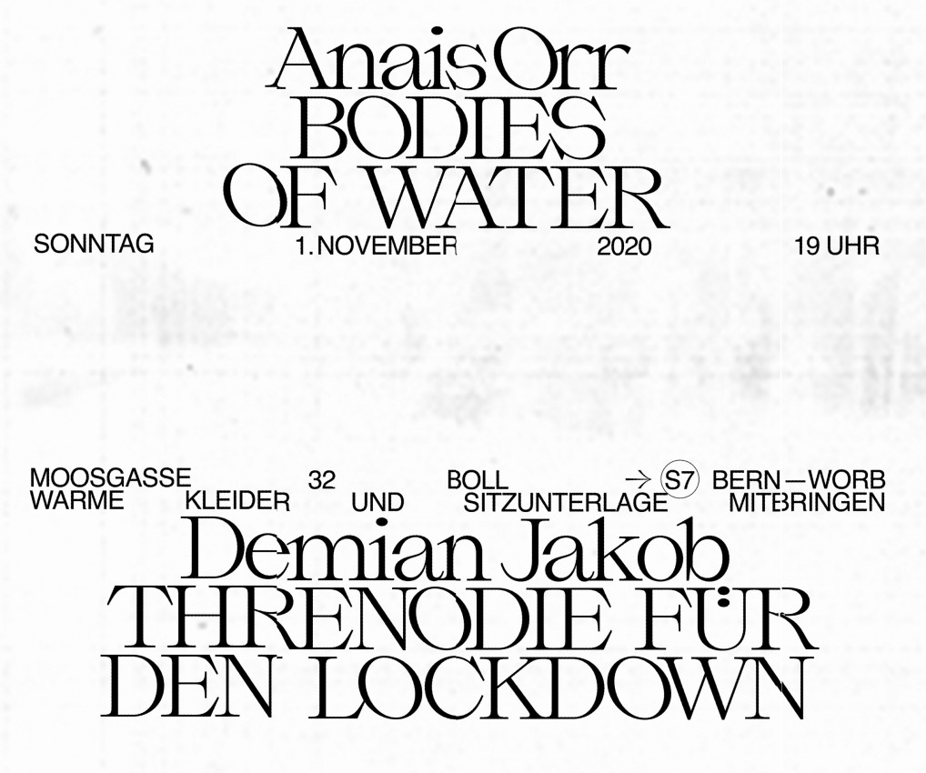
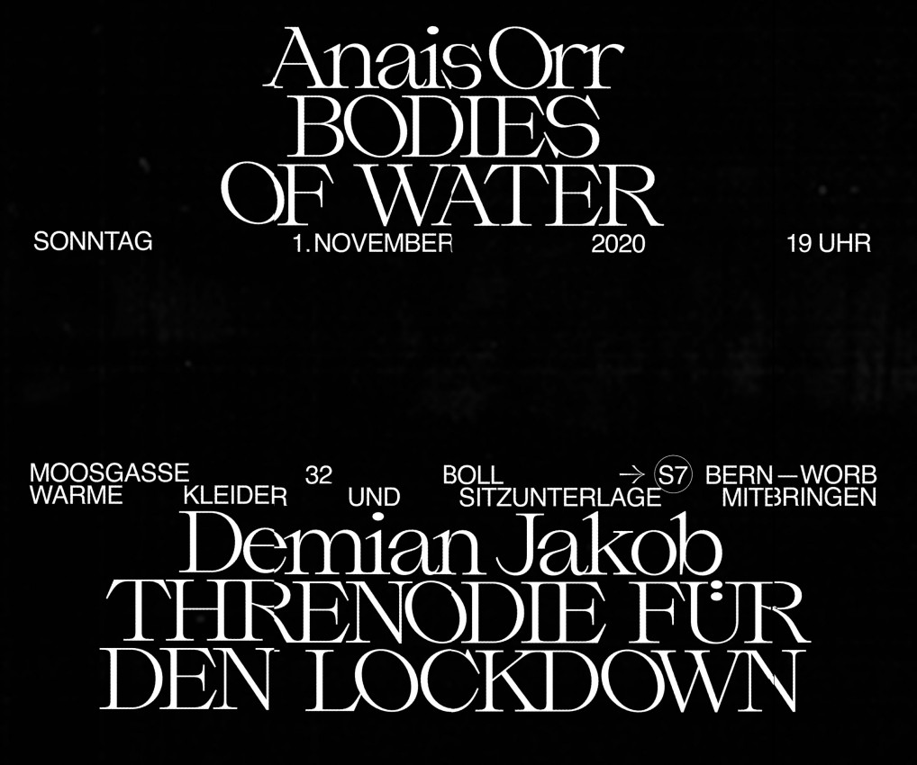
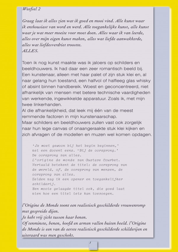
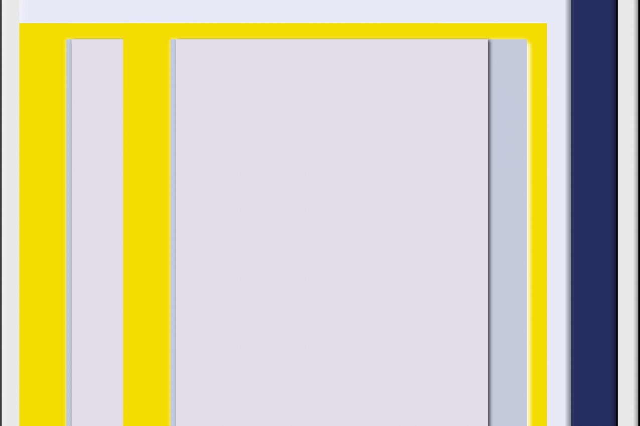
This low budget endeavour, pushed us towards mass-printing solutions—a full color A4 brochure on generic recycled paper—which shifted all the design-weight onto graphic design choices. As always, an extensive typography exploration is followed by lay-out and color experiments. Feeling the energy of her preliminary essay made it a playful and intuitive process leading quickly to the first proofs. [Img. 1, 2, 3] These focused on visually expressing a layered and personal story, rather than being distracting.
When covid hit the low-lands and an ‘intelligent’ lock-down was installed, a digital (pdf) version became an additional objective. The design was now altered so that it would work both in print, (in its original A4 size) and on screens. (by reducing the width only) [Img. 4, 5].
The family stay-home situation and Boermans’ low energy prevented her from giving the essay the desired attention. After much consideration, she felt her energy should be redirected into something new and that it was best to leave the essay in the past. She cancelled any further development of the project in May.
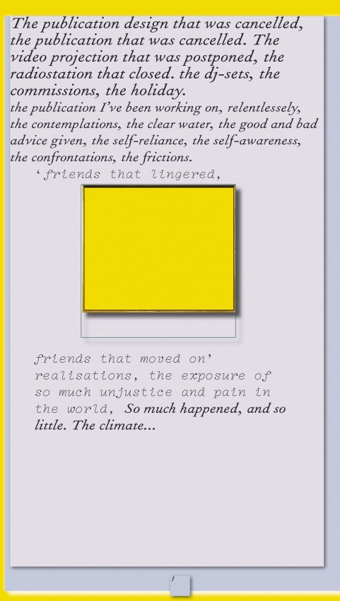
Her bold decision came at a time when, unsurprisingly, I had also entered a personal and professional existential phase. Working on my online archive publication now felt irrelevant, just like my oeuvre. I admired Ine’s change of direction, but I was disappointed that this exciting and artistically driven project had been canceled. When the BLM movement gained huge global momentum at the end of May, I began to re-appropriate the cancelled design to publicise my own roaring feelings. I am not a fan of emo-share on social media, yet the situation had gotten so real on an elusive personal and global level, that I was momentarily tempted to share my struggles in relation to the creative field’s discomfort. I did not go through with it. [Img. 6]
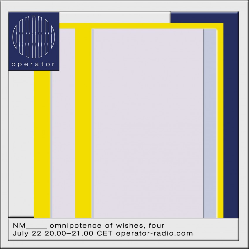
In the end it made its way into the social sphere. I copied the graphic layers into the instagram announcement for the first radioshow on www.operator-radio.com since lockdown ‘Omnipotence of Wishes, four.’ For each episode I created an image that is based on a visual project I am currently working on; a new version, a glitch, stage or rework or like this case, a discard. [Img. 7, 8]
Ine Boermans recently published her first successful novel and it is yielding amazing reviews. All ended well in the end.